Difference between revisions of "Mapping for Dummies/Lesson1"
(No difference)
|
Latest revision as of 20:49, 16 March 2012
| Mapping for Dummies |
|---|
Prelude
This tutorial will try to explain the steps all the way down to a map that can be included in UFO AI. While writing this, I assume you have read Mapping for Dummies / Preliminaries and have already worked through the basics of the Mapping for Dummies section. If not, please do so before moving on.
Lesson1: MyFirstMap
Before we start - The general plan
[open] this should be moved to "YourFirstMap"
Whenever you begin a map, it's best to have a plan in your head of what you're going for. If you're looking for a jungle scene with a river, a recreation of Stonehenge, a random map for a desert scene, or the Taj Mahal, even this basic step helps flesh out your imagination. Once you get more used to the editor, you'll have an idea of what's reasonable and what's not, but at least you'll have a starting point.
The second thing to think of is while a small map is a good place to start, there's a lot of space to fill in a map if you don't want to start off in a shooting gallery. What looks big in the editor while you're working on details is actually pretty small compared to the models. A real map will take time, patience, and love. It gets faster as you get more used to the tools, but anything thrown together looks just that... thrown together.
Goals of this lesson
Our first plan is to start with something small we can build off of later. We want to build a couple of simple components that we can copy/paste to something else, or that we could easily attach more to later. Our plan, then, is to make a small shed at the edge of a lawn.
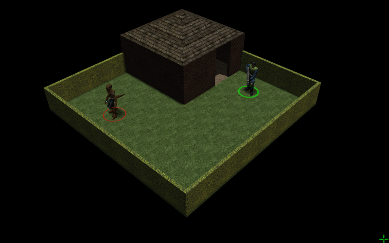
When we're done with lesson 1, we'll have something that looks like this:
Note: You have be very careful of the dimensions - this is extremly important to let the pathfinding work as you expected. See this tutorial for more in depth information. However, you do not have to care about this too much for now.
The Shed
Most of the time in this tutorial we will work in Resize mode. You can switch to it either by clicking the icon with the dotted square on the left toolbar or with Q. Check the tooltips which will popup when you hover over each tool mode.
There are other buttons on the toolbar that can switch you between modes. The modes are Translate, Rotate, Scale, Resize, and Clipper. See more about those at UFORadiant mouse and keyboard controls.
Something to walk on - the floor
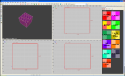
Our first task, then, is to give the people something to walk around on, namely, a floor. So, we start off by making a brush that will act as our floor. We want a little room to move around in, and a character takes up 32x32 for each 'move'. So, we'll make our Floor 128x128. Click and drag from 0x0 -> 128x128
The first item you build though tries to be a cube, and from then on will take the hidden height of the last object you worked with (So when looking from the XY view, it will autoassign the z to the same as last object). Since we don't want some giant box, but a floor, we need to make the height of the object 4. Why 4? A character is 60 units tall, and a level is 64. That leaves us 4 units to play with the ground if we intend to cap off a ceiling. Right now, though, it looks like this:
You'll probably want to adjust your grid by hitting 3, and then zooming in to the grid with Ins/Del or using MW ![]() .
.
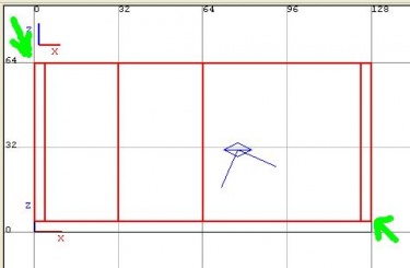
Now, in either the X/Z-view or in the X/Z-view window we click outside the object and drag it downwards.
Note : A few things of note when dealing with floors. Anyplace that you intend a player to be able to walk to MUST be above the Z=0 line. You can make negative z areas... but you'll break the pathfinding if any of the animated models find their way there.
We want the final product to look something like this:
| Step 1 | Step 2 |
|---|---|
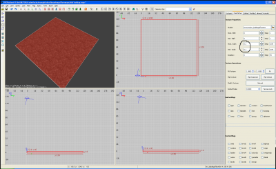
| Now, of course we don't want this ugly brick to be our final product, so let's texture the item. There is a <Textures> Tab in the sidebar. If we activate it we find the textures directory there. Were we want to go is /tex_buildings. Open this, scroll through the list and find floor001. Click it once, it will apply the texture and look like this: | Well, we applied the texture, but it's not very pretty and those are some pretty big bricks. Let's adjust the 'stretch' of the texture.
With the brush still highlighted, open the tab for the the surface inspector in the sidebar. What we want to do is adjust the Horizontal and Vertical stretch from 0.5 to 0.1. It'll look something like this: |
Something to hide behind - the walls
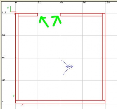
Now, we need some walls. Walls work with the same concept as floors, a width of 4 being the maximum a character can deal with and still move into its 32x32 block. Build a few brushes and drag them as needed, you want it to look like this:
There's a few important things to note in the above images. For starters, none of the brushes overlap. The walls are 60 units high, from 4-64 (remember our floor is 0-4), and none of them overlap each other at the corners. This is important because overlapping brushes makes the build file for the final map much larger in size for no reason.
In the overhead view, notice that I've left the 'door' from 32 to 64. The pathfinding works along the Grid 6 levels, every 32 marks being a 'step'. So, 0-32 is one box, 32-64 is another box, and so on. Players and aliens need these to be lined up so the pathfinding works correctly.
NOTE: An NPC or Alien CAN walk through any 24x24 space available to it (I've tested it as of Version 2.1), however, you cannot actively place a player there unless the 32x32 grid lines up properly. This means unless you're intending to give a huge positional advantage to the NPCs, do NOT stray from making sure your 'walking areas' are in the correct 32x32 locations.
Now, Let's apply some texture to the walls. This works the same way as for the floor. First, we select all our walls, using Shift LMB ![]() . In case you have problems with the controls, maybe this is a good time to take a look back at the basics.
. In case you have problems with the controls, maybe this is a good time to take a look back at the basics.
As for our walls, it will be a good thing to use the /tex_buildings/streetbricks14 for them. So with all our walls still highlighted, we select the <Textures> tab, select the /tex_buildings directory, scroll through the list of textures and click 'streetbricks14' to apply this texture on our walls.
We will have to alter the stretch on this brick as well for a more realistic look. 0.2 for both horizontal and vertical in the Surface Inspector does nicely, as seen here:
So, we've generated the beginning of a perfectly good building. It has no windows yet, I'm aware, and we'll get to those later, as it's easier to deal with those in another copy of UFORadiant with the Clipper tool and we haven't gotten that far yet. Save the map in case something gets awkward in the next session so you can start over. I think naming it "MyFirstMap.map" is a good idea, as we will use this name over the whole tutorial.
The roof and using the cone tool
So, it looks kinda silly being unprotected from the rain and all that you say? Well, I agree! So, let's roof our new building.
First, let's build the brush. Head off to an area not being used by the current design and build yourself a 128x128 box. This is the time when you might start thinking about keeping two copies of UFORadiant open. One for working with a small sample of brushes, another for the primary map. You can copy/paste between the two applications very easily, and it's something you'll have to do to work with the prefab_ files.
So, we've got our brush. Now, we need the cone tool (well, we want it to look like a real roof, right?). So, with our brush selected, click the Brush menu at the top, then choose Cone...
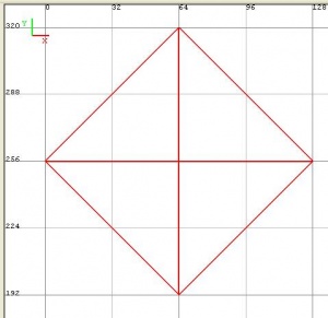
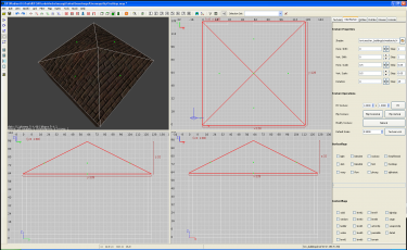
A window comes up, asking us 'Arbitrary Sides'. In this case, we only want 4 (the maximum is 32 and creates a pretty decent circular cone). We end up with a diamond that looks like this:
So, we need to go to the Modify Menu, and then use the Arbitrary Rotation tool to spin this 45 degrees on the z axis. Type 45 into the Z, and click OK. [open] this does not work for me atm, see bug #3497543 ShipIt 17:41, 11 February 2012 (CET)
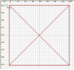
After this, we have to make a sidestep. If we take a close look at our roof, we notice that the size of the cone now is something like maybe 90.5096 units for the X- and Y-axis. Using the CSG-, Clipper- and other tools sometimes results in vertices beeing 'out of grid'. Setting grid to 4 with 3 and pressing Ctrl G ("snap to grid") will solve the problem. You should automatically do this after using one of those tools.
Now we adjust the size of the brush to just cover the 128x128 area by dragging it to the upper left, then enlarging it to the lower right. After this, it is possible we need to repeat our sidestep. Check the size of our brush carefully! If needed, use Ctrl G!
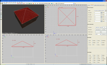
After all this trouble, we have created something like this:
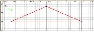
Now we need to adjust the height of the object and it's Z position. In both, Y/Z-view and Y/Z-view, we can see the object from the side. It's one giant honkin' cone at the moment, far to tall for a normal roof. Type V so you can grab vertices (corners), then select the point at the top. Drag it down so it's only 32, then type V again to turn off corner selection.
Now, in X/Z- or Y/Z-view, drag the roof, so it's bottom sits on the line for 64. It should end up looking like this:
Now, in X/Y-view, we drag our roof over the top of the building. We got it! Kind of. It's brick!
Let's change around the textures here, and while we're at it, learn how to apply textures to each individual face of an object. With the roof selected, use F for 'select faces'. You should get little green dots in the different areas of the cone. When you click one, you select only that face. Unfortunately, the only way to be sure what face you selected is in the 3d camera view, or via the blue dot. You should see something like this:
Also you can use ShiftCtrl LMB ![]() to select single faces or faces on different brushes.
to select single faces or faces on different brushes.
Now, we apply a texture. There's tex_buildings/roof10 (this will be the notation from here on for any texture we will work with) that looks nice. Set the stretch for horizontal and vertical to 0.1 for it in the Surface inspector. Now, when you're looking at it in the camera view, as we apply this texture to each face, some of them will be turned sideways to the roof. That's okay, and it's easy to fix. In the surface inspector, there's the Rotate option, right underneath where you've set the stretch. Set it to 90 when it's sideways, and you'll turn them straight. Hit F after this to turn off face selection.
Levelflags
Well, while we're here, and we're dealing with multiple levels, I guess now's a good time to introduce the level flags. These flags indicate when and where an object can be seen, when the player chooses a different 'level' to view (1-8) in the game. We want the player to be able to see into the building here, so now we've got at least 2 levels on our map. The level flags let us control this.
So, with our entire roof selected, let's go to the Surface Inspector. At the bottom we see the level flags. Turn on all flags from level 2 through level 8. This means we don't want it visible when viewing level 1.
Note : A brush, when all levelflags are disabled, will be visible on all levels. We could use this here for the walls and the floor, but we will not - it´s a trap! We will learn about the reason for this later.
Fast forward. Our Roof is still selected, making this a good moment to use the 'hide' feature. By simply hitting H we hide all selected items. Now that the roof is gone we can select the remaining brushes using Shift LMB ![]() . If, all of a sudden, you cannot remember how to select a group of brushes, go back to the basics.
. If, all of a sudden, you cannot remember how to select a group of brushes, go back to the basics.
With the remaining brushes selected, we enable levelflags 1 - 8 for all of them. There is a separate tutorial for levelflags here and some more information here. We have enough time - if you want to take a look, just do so.
We are back on our shed. First, let's do a little magic, bringing back what was hidden. Shift H will bring back the roof. Using the level buttons in the toolbar we can now check if everything went right. On level 1 the roof will not be visible, on levels 2 up to level 8 our whole shed should be shown.
Note : Using Shift H will not only bring back items that where hidden by using H. It will also set back the level selection. Thus, using Shift H will show ALL items of the map.
Landscaping
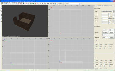
Note: I've shrunk the pictures down, so the page isn't overly heavy as they're each a nearly full screen shot. If you need a more detailed view, click LMB ![]() to see the image file. You can open it in full resolution there.
to see the image file. You can open it in full resolution there.
Extending the map
| Step 1 | Step 2 |
|---|---|
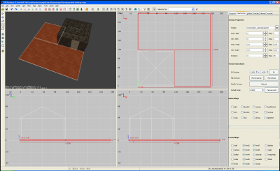
We dump some grassy areas outside our little building. Simple to do, we just build out two brushes as floors and attach the tex_nature/grass001 texture to it, like so:
|
And now, for some hedging. Think of it as installing walls only Z = 32 high. There's a texture for hedges, too, so use tex_nature/hedge001. (Don't forget to adjust stretch on both the hedge and the grass in the Surface Inspector)
|
To finish this, we set proper level flags to all of those brushes.
Adding terrain
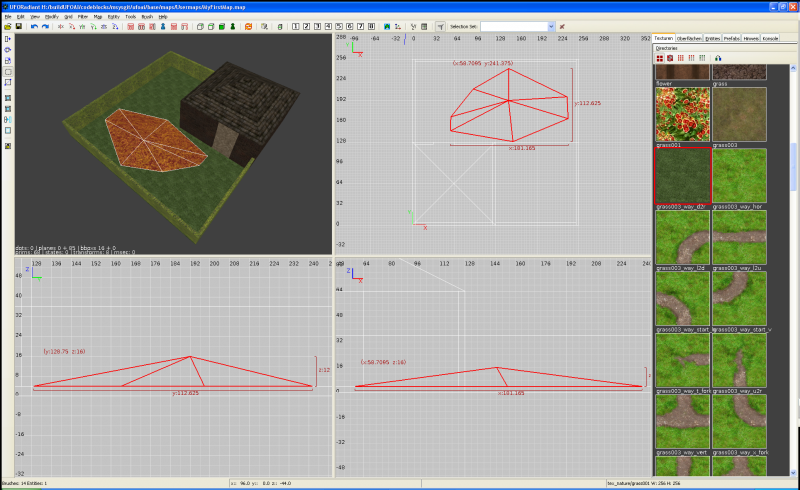
Now, I've never seen a completely flat lawn. It's usually got a bit of dip and rise to it. Not that for this game a flat region isn't acceptable, but nothing sells a groundpiece like not being freshly bulldozed. So, let's make ourselves a little groundswell.
The easiest way to do this is to make a new brush, then cone it for 7 sides. Now, select Vertexes V or Edges E and shove the cone around some. This is a good time to goof around with just how much you can affect a cone (or any brush for that matter) by hauling its pieces around the map. Adding extra corners by moving an edge around can get you some very interesting displays. I recommend doing something along these lines, however:
Please notice that the 'edges' of the hill meet the ground level, so that our models can walk up and down onto the hill.
Again, we have to assign tex_nature/grass001 and also the correct level flags to our new brush.
Aliens and humans
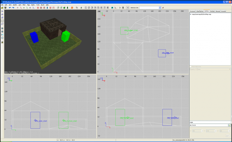
In order to make our map playable, we need at least two opponents out there. So let´s add the spawnpoints for them.
All spawnpoints have to line up with grid 32, else the game will refuse to place the actors. Using 6 will set the size of the grid this way.
RMB ![]() onto a random 2d view will open the Context menu - choosing Create entity leaves us with the Entity selector. There´s a lot of stuff in this list, we choose "info_human_start" and place the green box on our map. Again, this time "info_alien_start" gives us a blue box.
onto a random 2d view will open the Context menu - choosing Create entity leaves us with the Entity selector. There´s a lot of stuff in this list, we choose "info_human_start" and place the green box on our map. Again, this time "info_alien_start" gives us a blue box.
The spawnpoints use an absolute ("origin") position in the map, so we do not need to set levelflags this time.
Thats it. Save "MyFirstMap.map" now. This is the file we share with others for comparisons and edits.
Build and play!
To play the map (Yeah, really! We can play the map at this point in single player skirmish mode!) there are two points to solve. First, we need to compile it. Second, we have to tell the game about it.
Compiling the map
What we have at the moment is a *.map file. However, the game uses .bsp files, which we compile from inside UFORadiant or via commandline. For this, follow the instructions about compiling your own map.
Loading the map
After compiling our map, we need to tell the game about it. This is done in the /base/ufos/maps.ufo - read here about how to add the map there.
After this, you will be able to select the map in single player skirmish mode.
Next step
is Lesson 2.
Credits
Special thanks to Wanderer, who originally created this page.
Links
- Mapping for Dummies: Lesson 2
- Mapping - Tutorials and more
- Mapping/Dimensions - Explicit tutorial on Dimensions.
- Mapping/Tutorials/Levelflags - Explicit tutorial on setting Level flags.
- Mapping/Compile - Compiling .bsp file information.
- Console - Accessing the in-game console.
- UFORadiant mouse and keyboard controls
