Proposals/GUI comment
This document comment some 2.2.1 GUI to provide some proposal GUI. The only objective is the usability, i am not a good designer, and if i change some design, its only to create preview faster (with my hands).
This document is not about design, someone have another proposal for that. But, to be clear, i dont specially love the 2.2.1 "metal and green", because, here, to have a good roleplay GUI, maybe the only thing to do is to create something look like an OS (an a little futuristic if possible). The commander do not have in front of him a metallic system with green LCD screens. We can think he manage everything in front of his computer... like the player. I will not talk more about design :)
This document is a draft, help and comment are welcome. And i dont have a very good english, i hope if its not understandable, its at least readable.
Architechture
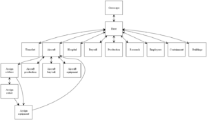
Current 2.2.1 architecture
- Soldier equipment is very deep, so it's hard to the user to access (lot of click, lot of reflexion). The soldier equipment GUI can't equip every soldier of the base, because, looking the architecture, it is aircraft dependant.
- There are a lot of aircraft GUI. The user can search some of them in another GUI. For exemple it exists a generic Buy/sell and Product GUI and also another one for aircraft.
- It is hard to move from a managment aspect from a base to another. It need to return to the main base screen, to the geoscape, to the needed base, to the managmement aspect need.
Proposal 1: Reduce deep of architecture
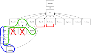
An idea to improve the navigation it to provide a more simple architecture (that user can easilly understand) by reducing the deep of the architechture. I.e. only one deep level of GUI from basescape.
- In red. This GUIs are specific for aircraft, but it exists generic GUI for that, that can contain aircraft. It request the same game element, for exemple, creating an aircraft or a lazer gun request technicians. Isnt it more easy to manage that in the same place? If we think it's important, it possible to add shortcut from aircraft GUI to the aircraft prodution.
- In blue. On the current UFO-AI GUI, managing soldiers equipement is very deep. Another thing, we can't equipe soldiers standing at base. It will be nice to merge some elements of GUIs to create a Soldier (or another better name) GUI, on the root of the basescape.
- In green. We maybe can create an only one Aircraft GUI allowing to manage aircrafts : equipe aircraft with objects, assign soldiers. It sure possible to have shortcut to the common buy/sell and the product GUI.
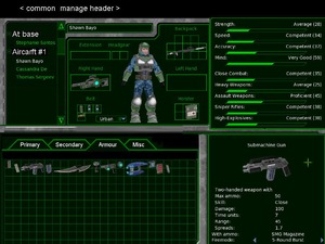
Proposal 1': A global header for basescape
As a complement to the proposal 1, we can create a common header for every managment aspect, that allow transversal navigation (a base to another, a managment aspect to another). It allow to navigate every where very fast.
I create this image very fast, it is graphically not very understandable. On the top (something like an header) there are two drop down menu, one for base navigation, one for management aspect navigation (search, buy/sell...). In bottom of that, we have all this space for the content (not a big change).
Proposal 2: One basescape for every thing
Another proposal idea to improve the navigtion is to use a left tab for the navigation (we can see something like that on some software : GetRight, old version of Firefox, eMule...). Player can easilly navigate arround GUI, and every time know where he is. We can display him some deeper GUI without problem. He can skip a GUI to move to another aspect (example from aircraft-equip to product), or changing base to manage fastelly the same thing (buy/sell on a base to another).
It reduce a lot the space for the content. For some complex aspects it can be hard to display everything, but we can split some GUI. Without too much place it force us to create a simple GUI, it can be a good thing for users. Anyway its hard to know if every thing is doable like that, it need to prototype every aspects. This document do not introspect more this proposal.
Geoscape
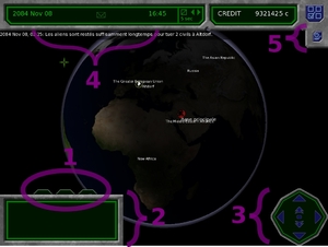
Current 2.2.1 geoscape
- This littles elements are hard to know it exists. It have nothing on common with the bottom content. I spend a long time to find how a create a new base. I think it need to move it somewhere elsewhere.
- This control take a lot of place, and dont contain every time information.
- Maybe its not very usefull? Or can be improved.
- Why date and time are separated?
- The position of this button is not very nice, because very far than the thing it change, and it look strange. Plus its not a button, we can't click on it; and the icon is hard to understand.
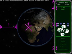
Comment about 2.3.dev
- Big marge. The right panel is a part of the GUI (not a little foating window). A better center position for the earth is 1'.
- We can simplify this by moving the base creation as a part of the "Create installation" into the dialog box of create installation. It reduce the choice, and the error by wrong click. We can do it without problem, because both buttons are not often use.
- It need to move somewhere buttons about earth display, and others.
- This controls are very often use, but are realy small. BTAxis provide a good idea to improve the managmemnt of the time. If no, at least using bigger icons will help.
- Not important, but. All digits of the font dont use the same width. When the time move fast, the display of datetime "jump".
- (no number in the image) From 2.2.1 to 2.3 i no more see the hilighted mail icon (to say we have a new mail). Mail icon is a very good idea of the 2.2.1 to improve the immerse.
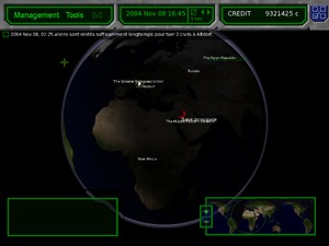
Proposal
- A nice thing will be to navigate using a classic menu. Here we see on top "Management" and "Tools"
- The "Management" can provide fast link for all management GUI (of the selected base, else, of the first base). We also can create a new base with it.
- The "Tools" menu contain help to manage. A link to the encyclopedia, to the statistics, to window with the message history. We also can add a check menu to display/hide the "mini geoscape"
- Datetime information are grouped on a same place. BTAxis provide a good idea to improve the managmemnt of the time, but i dont update my screen with it.
- Credit are alone.
- The button using to display the event list is now on the left, near list. I change the style for something green, because the list is out of the metal. A nice thing, maybe, will be do display the event list every time the cursor stand over the last message. Plus, a new window (with a scrooll) can be add on the tool menu.
- Without the three little buttons on his top, we can't hide the window displaing aircraft and mission information when it is not used (empty). It also possible to add a little transparency.
- A "mini geoscape" to replace the old earth navigation control. This control is maybe not very important, and can be display/hide using an entry on the tool menu.
- By clicking on a base on the geoscape (right click, or long left click), we can create a popup menu to access to a specific management window.
Basescape
Main
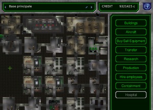
Comment about version 2.2.1
Todo
Proposal
I dont think this window is need, but as we can see on the work of BTAxis it can provide a nice "statistics" about a base; and sure some links to sub windows.
Buildings
Comment about version 2.2.1
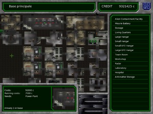
- First of all, there are a strech of the base (from main window base to this screen, the ratio change no?), and a part of the base is covered by the GUI.
- Construction of some elements dont provide a good preview of the size (example : the workshop)
- By left clicking on a construction, sometime we go to the encyclopedia, sometime we go to the window management of this aspect.
- By right clicking we can destroy an element. Right click is only used here. I dont think UFO-AI use right click somewhere elsewhere, so it's hard to know how to destroy. Right click can be a usefull shortcut, but not the only one solution to do this action.
Comment and proposal about version 2.3.dev build 19350
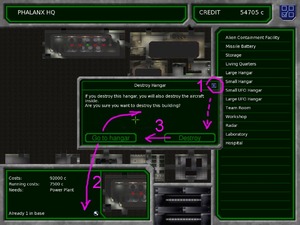
- 1. This little cross is nice, but a cancel button can help. It is a common thing to have both a validate button and a cancel button.
- 2. "Go to ..." maybe not use a good position. First its dangerous for a user to request a destroy only to use the "go to", so we can add something in the preview. For the button into the dialog windown, a better odering of buttons is, from left to right, "Destroy" (validation), "Cancel", "Go to...". It also possible to have 2 lines of buttons (with a marge between the two lines). "Go to..." alone on the middle, and "Destroy" and "Cancel" on the bottom (commonly with right alignment).
- 3. Already say, it is a common thing, the validation button must be the first at the left (for ltr languages)
Proposal
- This window do not display a lot of content. It can be easy to display the base on back ground, covered by to floating window (contruction of base element, and preview of an element).
- It need to preview the real size. What i see is what i will construct. With a floating window, no problem of size.
- It maybe better the left click on a construction only update the preview window. This preview window can provide two links, one for encyclopedia, another one to from the current window to another managment aspect.
- Not hard to add somewhere a garbage icon. On the construction windows (click on the on the garbage icon, and next click on your construction) or on the base element preview (click on the element, and next click on the garbage icon)
- We maybe improve the player imertion by providing something that look like more an architectural plan?
Aircrafts
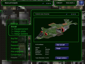
Comment about version 2.2.1
As i already say, it maybe better to move buy/sell, produce, and soldier equipment somewhere elsewhere. That why i will not comment this windows.
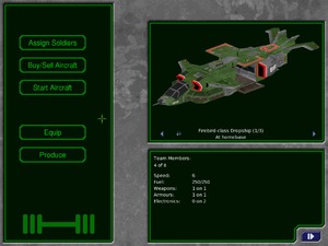
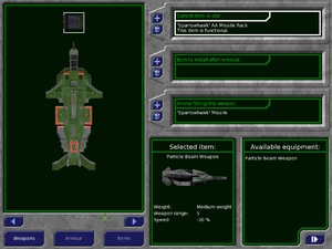
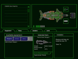
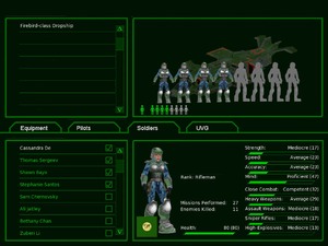
- First thing we can see, the first two windows are simple, without too much element, and with all information it need.
- A very big problem for me is the aircraft equipment window. I dont very well understand this GUI so i can't realy comment it. It look too much complex for what it provide. At the present i never use "Item to install after removal"? Its a complex concept, maybe the system can hide (display a time to remove and a time to install).
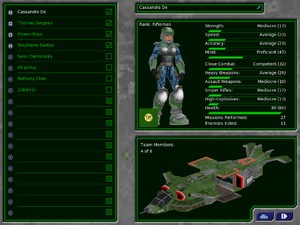
- All this three windows is about an aircrfat, but the position of his graphical representation everytime change from a GUI to another (on top in the first, on bottom in the second, on left in the last).
Proposal
I think its possible to merge all aircraft windows. But while i dont realy understand all the thing on "equip" and the content of "UVG", its not easy to me to know. The proposal is to have a splited horisontal window. The top window is used to select and preview the aircraft.
- Equipement of an aircraft look like more than a soldier equipment. Like than we can easily see everything is equiped on an aircraft. As i already say, i am not sure of the bottom content. Help to understand the 2.2.1 GUI and to improve this proposal is welcome.
- Soldier affectation dont change a lot. Like the 2.2.1 assignment window, we can (un)check soldiers. Its a very nice solution for a compact GUI.
Generally a checkbox display in left the check ans next the label. Is it better to switch it? I dont knowFinnaly the check box is at the best place, because the list is first aimed to look at soldiers (updating the right part of the GUI). Soldier information is evily compacted but its doable without loosing information. This current layout of information can maybe improved. - ...
Proposal
Here we have the same mochup, with the element size used by the 2.3 game. This more easy to update the game with this one. Purple color, hilight some change or new elements of the GUI. At the moment, we can remove the "Tank" tab.
Soldiers
Comment about version 2.2.1
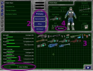
- 1. This control dont help the management. We every time need to switch from one view to another, specially when we begin.
- 2. This control is a filter for the item list, but it is very far. It something like a tab control, without the look or the position of a tab.
- 3. This control is very big, i never see it overloader.
- 4. We dont use this control like a checkbox, its not a good idea to use a checkbox view.
- It can be more clear to provide a box for armour?
Proposal 1
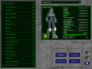
- There are place to display item and player info in the same window without a lot of change. The window is splited horizontally in two, on top all thing about soldier, and on button all thing about items.
- The soldiers list is here very small, and its now a tree list. Anyway there are a scroll. We we can select every soldiers of the base, but it also possible to select soldiers assigned to an aircraft, if it need.
- Item filter in now a real tab on the top of the items container. "Misc" is the last element because, we think like that, searching a category for an object we need from 1. to 4. In order, if its not a "Primary", not a "Secondary", not an "Armour", i click on this last tab because i dont know what it contains. If i search an armour i dont click on "Misc" because i alredy read "Armour". The items container is smaller, but we can at a scroll.
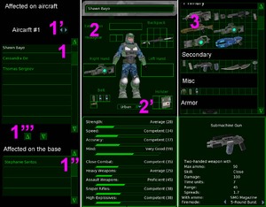
Proposal 2: three columns
Another idea will be to have 3 colomns. The first for soldier selection and affectation, the second for soldier inventory and caracteristics, the last for items and caracteristics.
- 1. Well, this is overcomplex. I think the simple tree list of the proposal 1 is greater and i dont update this window. A good thing is to drag and drop soldier into this list (but its not the only solution to affect soldiers to an aircraft, we also can do it into the aircraft GUI). We have space to display an aircraft preview (when we select a soldier from an aircraft).
- 2. I reduce a lot this widget. Some of element are over the soldier preview, i hope its technically possible? This over element are maybe not a problem if there are transparent. I move "extension" on the top, i dont know what it may contain, so can be a very bad place. 2' Here we use a dropdown list.
- 3. One of the harder widget to code. This layout is maybe greater than tabs, because, with one drag and drop into the scroll we can know all items we own. We also can vertically expand this control we a display/hide button for caracteristics. With it maybe we never need to scroll to take all the thing we need. With more time, we can improve this part of the GUI for something use in 3D Studio (scrollable and rollup box http://Youtube video, at minute 5:20), and/or ordered items as is it proposal by BTAxis (one weapon by line with his munitions)
Buy/sell
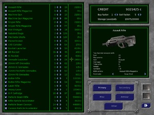
Comment about version 2.2.1
- Filter buttons are very far, without a good layout to understand it control the list.
- The list is very hard to read.
- "Misc" and "other"? it need to clarity this ("soldier misc", "Base equipment", something like that)
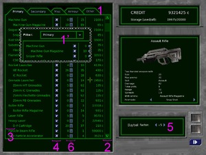
Proposal
- 1. Tab is a very clear element to display thing like that. It display where we are and every thing we can have. But it take a lot of place. We can use multiline tab (i dont specially like that). 1'. A more compact think is the use of a dropdown list. It display where we are, and by one click, every thing we can have. There are place to display long name like "Primary weapon", or "Primry soldier weapon", or... "Filter:" is maybe not the better term.
- 2. For long list, a scroll is really a need. It help the navigation and display the size of what we can't see.
- 3. Little marge for ammunition can help a lot. Here its a more readable list, no?
- 4. I move the check, because the list is not a checkbox list. The focus is not on checking element, but the check is just a part of the element list. Focus is on element name. Also, it maybe contribute to have a readable list.
- 5. First, i think two distinct factor is not a need (it can be false). And maybe its more logic to incrase se samething we incrase. I move this control from the top, because, maybe we dont show it very well on top. I change it a little, the "x" maybe else to understand is use.
As it said in the proposal architecture, it possible to add button for aircraft and aircraft equipment hereAlready done in the 2.3.dev.- 6. If it's possible, it will be nice to use a vertical control for buy/sell, instread of an horizontal one. It also helps to understand where is the number of item own by the base (the number near the spinner).
Research
Comment about version 2.2.1
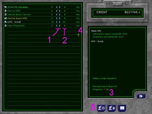
- 1. This control use a representation to move personnel from the right (unassigned) to the left (assigned to a research) by clicking into the direction of the move. But some people can understand this control is to change the left number (left to decrease, and right to incrase), without seeing the idea of move, and click on the wrong arrow. There are a conflict.
- 2. This number is duplicated, and with more than one base, it look a little strange (here we see "8" and "16")
- 3. This number is maybe the more important.
- 4. I dont understand what "mx." is?
- 5. Position of this button look strange, because it look like something about all the base, but its only about the selected research.
Proposal
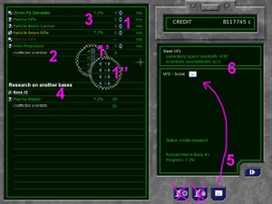
- 1. There are only one number (number of scientis assigned), plus the direction of the control help, top arrow to incrase, bottom arrow to decrase. 1' it possible to use another more understandable control ; 1'' or an horizontal control, but its less understandable.
- 2. On the bottom of the list we display the number of unassigned scientists.
- 3. We have space to display the research progres for all elements (when it need)
- 4. Research into another bases are separated. With it we know "Plasma Blaster" exists somewhere, and a click on "Base #2" can move the user to the research managment of this base.
- 5. The mail icon is into the box about the selected reserch. Maybe its very easy to move a lot of scientis with the list (a loooong click), that why i remove two icons, but we can move this button near the mail (on the green box).
- 6. A clean separation between information about all the base, and information about the selected element.
Production
Comment about version 2.2.1
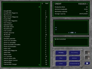
- It look simple, but its a complex screen.
- The right part of the GUI is maybe a little hard to understand, because right part of UFO:AI screen look like that dont use this part for changing the content, but for displaying informations.
Proposal
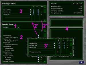
Here im not sure about the improvment. I thing it look more complex, but its more easy to use.
- 1. Use something near the list to change this content. A tab or a dropdown list.
- 2. A clear separated list for allowed productions, with a scrollbar. 2'. a button to init a new productuion : quantity = one. 2''. The same column of the 2.2.1, here the number is clonned from the "allowed items" and the current production list.
- 3. Graphically a separated list for production. It merge all controls need to change priority and quantity, and remove. 3'. Here it is another proposal for something look like the research. It allow to product more than one thing at the same time. Not sure you are interested by that.
- 4. A big place for all information about the selected production (hour...) and the selected item.
Add button for aircraft and aircraft equipmentAlready done in the 2.3.dev
Hire employees
Comment about version 2.2.1
- The GUI provide an only one list for every persons (on or out of the base, with a filter for soldier/medic...). It allow to fire/recrute a person by an only one click. I think we lose here a "human" relation.
- We dont know very well how many people we employ, how mny places there are. So it dont help some decision before action like "i only have 2 places, well, i will only check one technician and one scientist"
- The filter buttons are very far from the list it change.
- Without a real scroll, its a little hard to look at all a big list.
Proposal
Idea is to improve a little the roleplay by changing the GUI. And sure providing a more usable GUI.
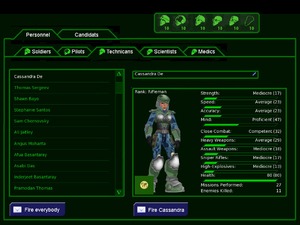
- The GUI is splited with two level of tab. The first one create a separation between personnal at base and people wanted to be recruted. The second level of tab is for jobs. A double tab every time look a little strange to me, but i dont find a better solution. Icons of BTAxis (into tab) help a little to distingue the two tabs.
- To implie the player in the desision of recruting/firing, it request a click on a button. It look like a mail, maybe a mail to a secretary.
- I reuse the very nice "personnel" cartouche create by BTAxis to display how many workers by jobs and how many place exists (the dotted icon, anyone? a better icon?).
- I have no specially idea about the job order. I put from left to right "soldiers", "pilots", "technicians", "scientists", "medics" because maybe soldier and pilots are more important. A better solution can be to use a simple alphabet sort (language dependant). Anyway its very important to use the same border for the job cartouche and for the job tab.
- I remove the checkbox list to change the gameplay, not the usability. But we can see for classic action its no more hard. To fire five scientists i only need to click 5 time into "Fire Foobar", without moving the mouse.
An improvement can be create to help player to find caracteristics he need, specially for soldiers. For example to request "I search a sniper". Sorting the list according to a selected caracteristic?
Containment
Comment about version 2.2.1
- We have only an information of a group of species. In a Zoo, or anywhere (in a laboratory?), maybe we have a individual identification, with a name...
- Little blue/red dot at the left of the species look strange. And a lot are unused (gray one).
- Graphically hard to understand what is about left and right arrow on bottom right?
- Here the article of the encyclopedia is maybe not need. It's a managmement window.
Proposal (need to rework that)
Here it maybe possible to improve the roleplay by changing a little the GUI.
Every alien individu must be considered individually, sorted by species if it need. We can name every alien with something like "Specimen #1". Think individual the code structure can help to improve the credibility of the containment, specially for the universal serum research, providing individual information about healthdone in the 2.3.dev.- There are space, its possible to also display a summary, number of specimen by species. What we see on the 2.2.1
- Its a prison. Displaing something look like an output of a safety camera will create a very nice game immersion. Ok, i am dreaming.
"Disabled" element say we can interact with it, in another context. It better to hide unused graphical elements, or non interactive elements (gray dot, arrow near button)(need to rewrite this thing, by proposal a preview).
Hospital
Comment about version 2.2.1
This current layout take a lot of place, for, maybe, nothing. Everytime we want to update something, a window overlap the current one.
Proposal
It maybe important to do everything with an only one window.
Todo.
Battlefield
Comment about version 2.2.1
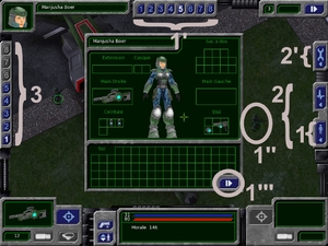
- Usage of the window equipement can be improve a little. When the window equipement is open :
- 1. If we click on this control, the window dont close it. Some time we are not in the good soldier, it's important to allow the close like that for conveniance.
- 1'. If i click on this control, the window will close. Why? I dont request to close the window, i just want to see another solider inventory (searching someone with a sepific weapon, for example). If i want to close it iv got a button to do that.
- 1". Same thing. If i click on another soldier from the battlefield, the equipemment window will close. I dont request it, iv got a button for that. i just want to see another solider inventory (searching someone with a sepific...).
- 1'''. Generally to close a toolkit window, we click on a cross (on the to of the screen). Here we v got an arrow (the same used to end the round), it can seem if we click there are another window.
- 2. and 2'. This three buttons look the same, but are not use the same. The 2. open a toolkit window into the game, the 2' break the game for a fullscreen configuration. Its important to break the simillarity of this three buttons. At least, removing the litlle arrow on the 2' or adding more space betteen the two groups.
- 3. it look to similar than the soldier selector 1 to 8 levels, 1 to 8 soldiers. Same buttons.
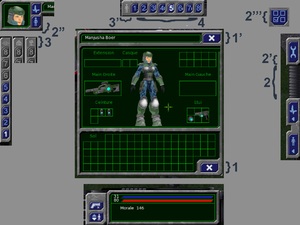
Proposal
- 1. A better thing will be to have a cross to close, but on the botton its not very classic (is it a cancel button?) ; 1'. that why on the top of the window, its better, but its harder to change the current interface (backpac).
- 2. we can add a space between controls ; 2'. and remove the little arrow in the "tool" button. 2" it also possible to move solider buttons somewhere near a soldier information. 2'''. a nice thing will be to reuse the same configuration button we can see on the geoscape (coerency).
- 3. and 3'. we can add little pictograms to say what this control is about. We can see more than one proposal, but the first (the little grid, i find into the PDF documentation) is, i think, the best. For levels, it will be nice to use a control with metrics information, but maybe its hard to find a good representation and to implement it (a stake of box?).
- 4. To solve the question "Have I finished my round?", we can display the action point that each soldier own (a percent bar) (if its technically easy to do that?).
Global
Internal coherence
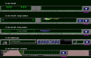
Its very important to use the same representation for the same usage and the same result. Currently some part of the GUI use different pictogram/graphic control for the same thing, or same pictogram/graphic control for different thing. Its often very simple to patch, but it help a lot new user to understand and use the GUI.
As an example from top to down:
- We can click on this icon to go to another GUI
- We can't click on this icon, it just something to display a status
- A button to return to the global basescape
- A button to config the game
- A button to return to the global basescape (return to the parent window)
- A button to go to the next window
- A button to go to return to the aircraft managment (return to the parent window)
- A button to end this round
- A button to close the window (return to the parent window)
External coherence
Todo.
