User talk:Psawhn
Tutorial
This is a draft of the tutorial aimed to help people use my blender gui template: menu_creator.blend
Blender is a very powerful creation suite. It is commonly seen as a 3D modelling and animation package, but its video sequence editor and postprocessing compositor are powerful as well - in fact, it is the flexibility of Blender that allows me to make this template.
Prelude
Blender can be downloaded from www.blender.org. There are a list of blender tutorials under the Blender Page in this wiki.
I will cover many topics that should help a newbie at least create a menu with my template file, but to really learn I suggest you look at one of the blender tutorials.
Downloading and Opening the file
I suggest downloading the menu_creator.blend file to its own directory or folder. It creates additional image files that may create clutter, or (hopefully not) overwrite other image files.
Opening the file (in windows) is as simple as double-clicking the file. This is probably the same under linux systems as well.
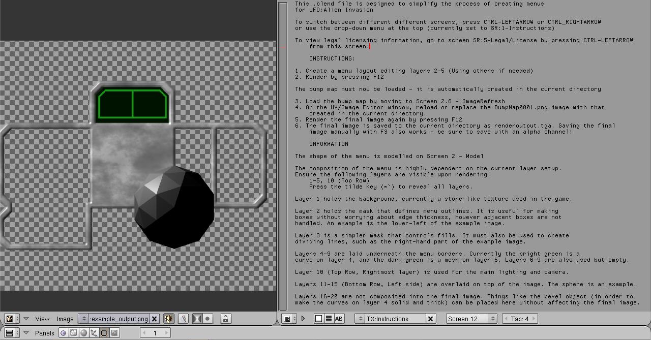
As soon as you open the file, you should see this:
I probably broke the width of your browser window by posting that. Sorry. :( I work from a laptop with a screen resolution of 1280x768, and I'm too lazy to change this just for the tutorial. :P
I recommend you read this text file, as it contains basic instructions and information. Of course I'll guide you through making a new personalized menu.
One of the strengths of the Blender interface is its windowing system. With just a few mouse clicks, one can create or dissolve window panes, allowing easy changing of the environment.
The user preferences are actually 'hidden' from the user. Instead of browsing a menu to find the options, you uncover them by mousing up to the border between your text/image panes and the status windows at the top. Drag this down to reveal the options! Haha! One of these options is the choice between LMB-select or RMB-select (the default.) I use LMB-select most of the time, because that is what most other applications use, but the choice is definitely up to you. Funnily enough, saving user preferences also set the current .blend file to open up when you start blender. I recommend starting a new file (FILE->NEW), making your changes, then saving with CTRL-U.
Now we get back to the file. For those who don't want to mess around with blender's windowing system, luckily for you, I created customized Blender screens. These allow someone to quickly return to a particular layout. These can be accessed by the drop-down menu at the top (currently it says SR:1-Instructions) or by using the CTRL-Left/Right Arrow keys.
Let's change to the SR:2-Model screen. You can use the drop-down menu, or press CTRL-RIGHTARROW from the introduction screen.
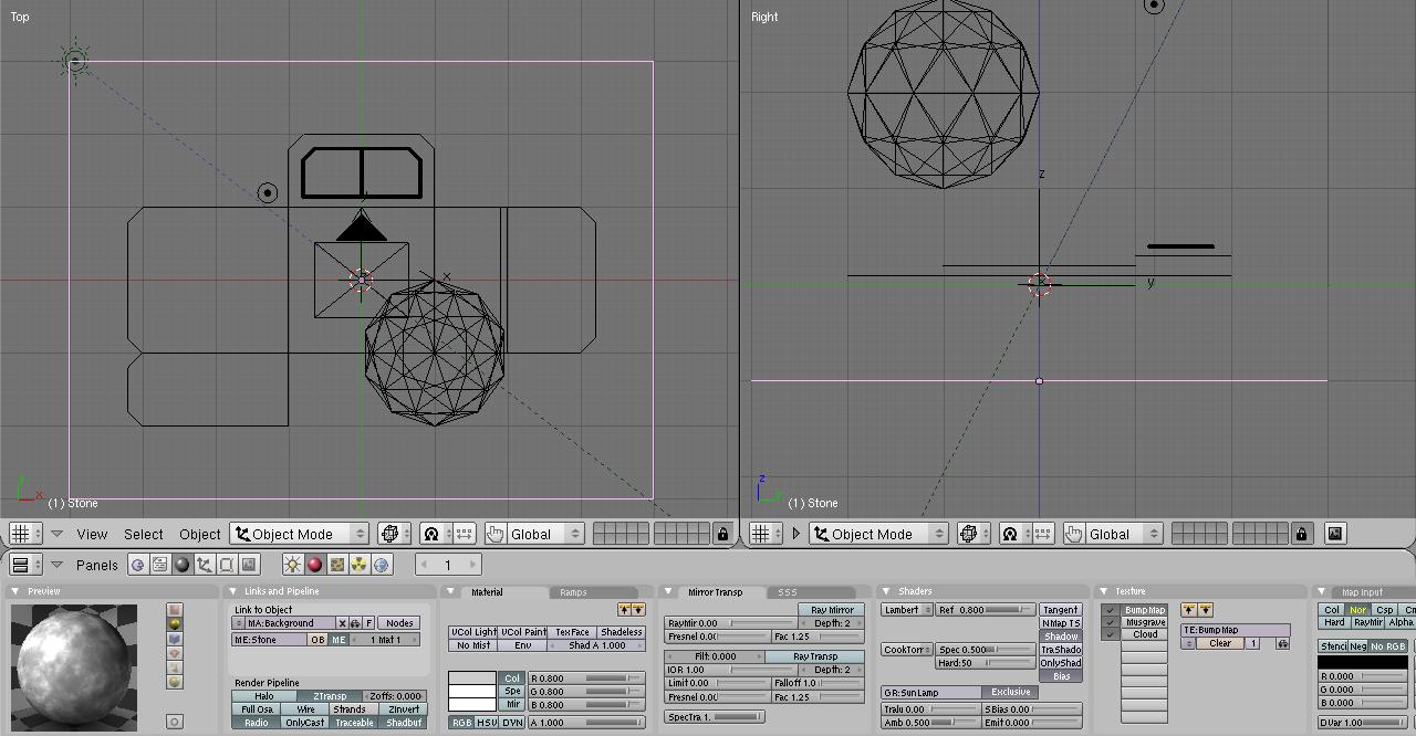
This is the model screen as will probably show up. Here we have three panes: Two 3D views, and a buttons view which is currently viewing materials. We'll get into making the model as soon as I've explained the layers.
The twenty buttons highlighted in a red box are Blender's layers. I've set up the compositor so that objects on a specific layer are used for different purposes. Just keep to the layers and you'll be fine. You'll also have to enable all layers (like in the pictures above) to compose the final image properly. To select a single layer to view, just click it. To select multiple layers to view, hold SHIFT while clicking on the layers - this works to subtract a single layer from the view, as well. To enable all layers quickly, just press the tilde (`/~) key.
I number the layers left-to-right, going down secondarily. That basically means that the layers are numbered like this:
[01][02][03][04][05]  [06][07][08][09][10]
[11][12][13][14][15]  [16][17][18][19][20]
SAVING:
We can save the work to a new file by pressing F2, or going through File->Save As. If we want to save to the same file, press CTRL-S or CTRL-W, then click on the confirmation line that pops up when overwriting a file.
Now let's work on making a GUI. Here's a picture of what we will eventually accomplish: (INSERT PICTURE HERE)
We'll start by modifying the contents of layer 2. You don't need to touch anything in layer 1 unless you want to change the background from the default stone. (That's not covered in this tutorial - you'd need to understand Blender's materials or textures to work with that.)
Layer 2's contents are used for the outlines of boxes, without worrying about the hassle of edge thickness. We'll use this to create the boxes on the right side and the bottom left corner.
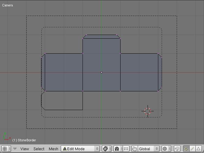
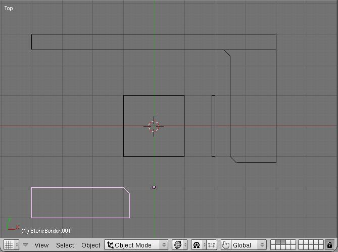
First, let's click on layer 2 to isolate everything. The default view is top-down, but we want to put part of our text border on the edge of the screen, so also press the 0 key on your number pad. Your view should now look like this:
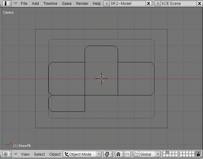
We can zoom in this view by scrolling the mousewheel or pressing the [-]/[=] keys. This is important because Blender's snap-to grid relies on the current zoom. Depending on your settings, you can use the middle mouse button (MMB), or SHIFT+MMB. Be careful, though - doing so will take us out of camera view, and we won't see our bounds anymore. Just press Numpad 0 again to go back to camera view.
Let's start by selecting the center mesh. You should see it become highlighted pinkish-purple. If you saw a little doohicky that looks like a target instead, you used the wrong mouse button for selecting. ;) What you did instead was place the 3D cursor at that location. No biggie at all. ;) Just use the other button to select. Once your center mesh has been selected, press the TAB key to enter edit mode.
Now we start to be able to edit our GUI. First we should clean up the mess I left behind by selecting the two rightmost vertices. You can hold down SHIFT and select both, or we can use the box-select tool. Press the B key, then drag a box across these two vertices. The selected vertices should turn from purple to yellow, and we can delete them with the X key, then select Erase Vertices.
Now let's move the box over to the right. Select the new right-most vertices, and start moving them by pressing the G key, which stands for "Grab." Now moving the mouse around causes these keys to follow. If we hold down CTRL while moving, these are constrained to move in discrete increments - useful for making straight lines. If we hold down SHIFT, it gives us more fine control when moving things.
Let's hold down CTRL and move these vertices to the rightmost dotted line. Because these vertices were aligned to the grid to start with, they should still conform to the grid after moving. Press your LMB again to confirm the movement. Now we should see this:
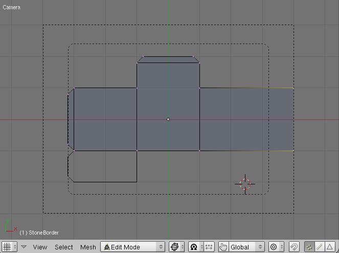
Now we deselect everything by pressing the A key. This key deselects everything if anything is selected, but if nothing is selected then it selects everything.
Now let's select the topmost four vertices and move them upward to match the top of the window.
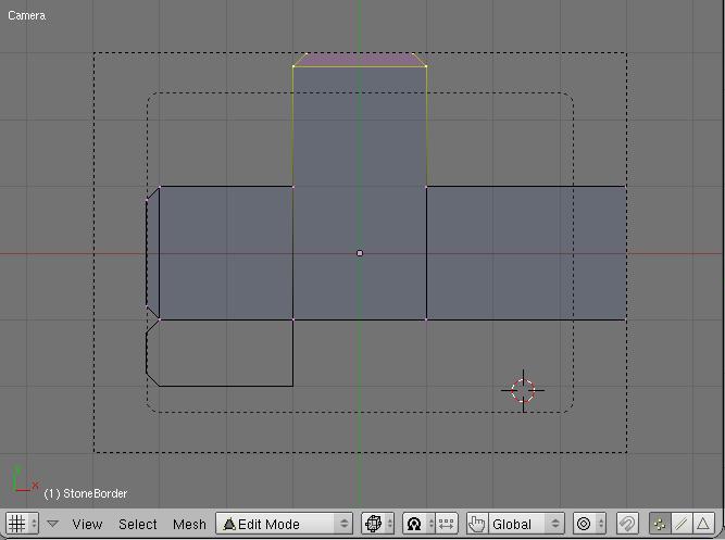
Now, since we want this part of the bar to stretch across to both corners, we'll have to change the locations of things underneath the grid we are using. Select the top-left vertex, and move it 0.2 units to the left by holding both SHIFT and CTRL. Confirm this, then move it 3 units to the left to the top-left corner. Let's do the same to the vertex directly underneath it.
Things should currently look like this.
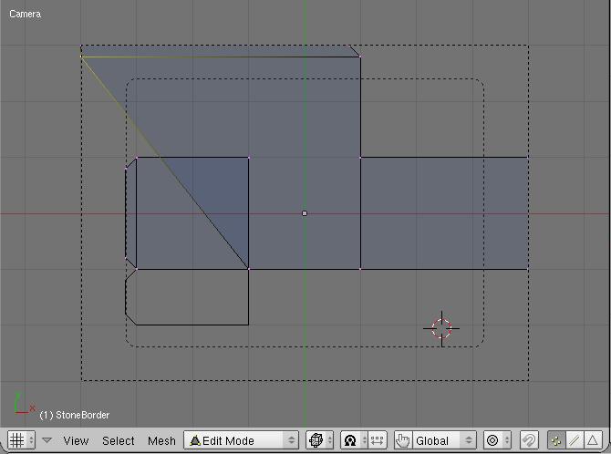
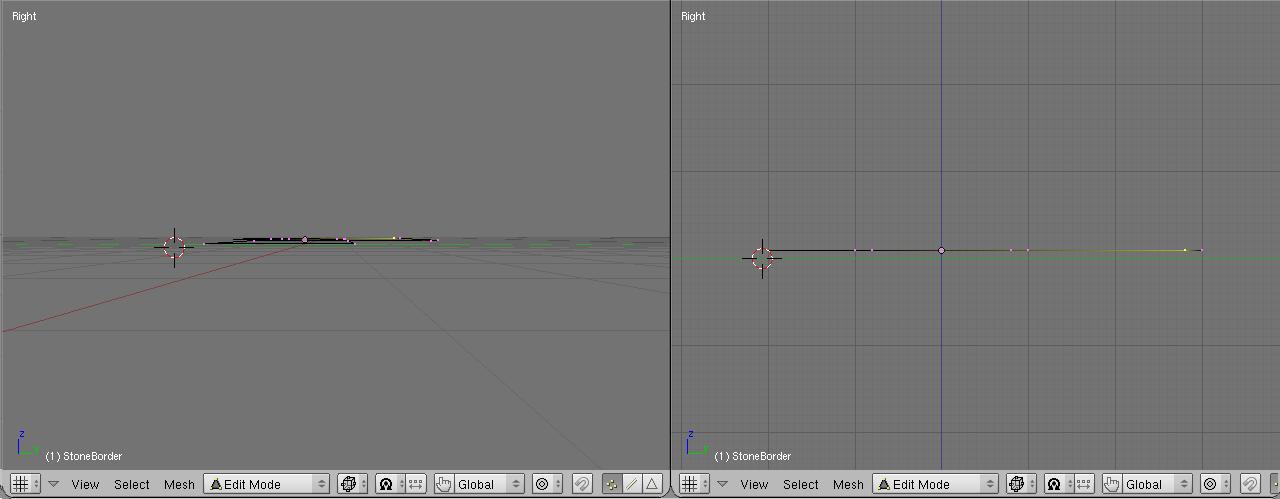
What we just did is made it easier on us to find the borders of our screen. Let's return to our top-down view, but first we want to check if a side effect of panning out of camera view is applied - perspective mode. We want to model in orthographic mode, but we should check by going to side view - press the Numpad 3 key.
If your view looks like the one on the right, there's nothing to worry about. If it looks like on the left, though, you'll have to press the Numpad 5 key to switch back to ortho view.
Now press Numpad 7 to return to top-down view mode. Now we can zoom and pan more easily. The first thing we want to do is delete a lot of our extraneous vertices - we'll fill in things later. Select everything except the vertices we already moved by using the box-select (B key) multiple times, or hold shift and select each one by mouse click. Delete them with the X key - erase vertices.
Basically, what we want to create on this layer is a mask. The compositor will take the outline of this mask and apply a border to it later. Let's fill in the rest of this basic mask.
Select the two vertices in the top-middle and drag them to be in line with our rightmost vertices. Now let's open this bar a bit by dragging the bottom vertices downwards 0.3 blender units. Look at the status bar at the bottom of our pane to be sure. Now our window should look like this:
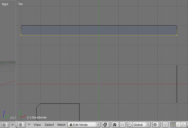
Let's fill out the main box on the right. Select our earlier two vertices on the right side, then press the E button for extrude. Select the "Only Edges" option, then move this new line 1.5 units to the left.
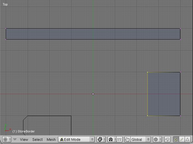
Now let's bevel the bottom of this. Select the bottom two vertices of this window, then extrude it 0.2 units downward. Select the left vertex, and move ([G]rab) it 0.2 units to the right.
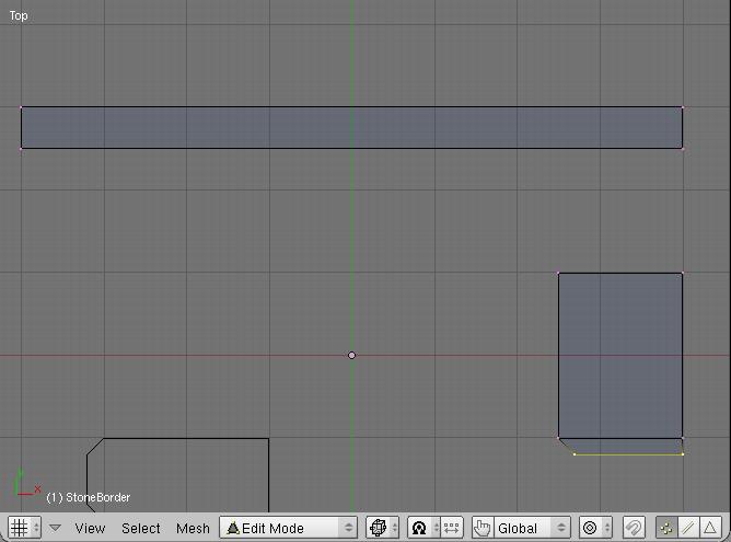
To create the upper inside corner bevel, we should create it first
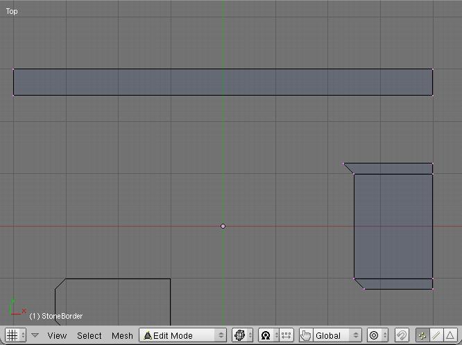
Then move it upwards. Now let's work on the bottom-left dialog. Exit edit mode by pressing TAB again, select the other dialog, then press TAB to enter edit mode. Enter camera mode briefly to let us align it to the bottom-left corner.
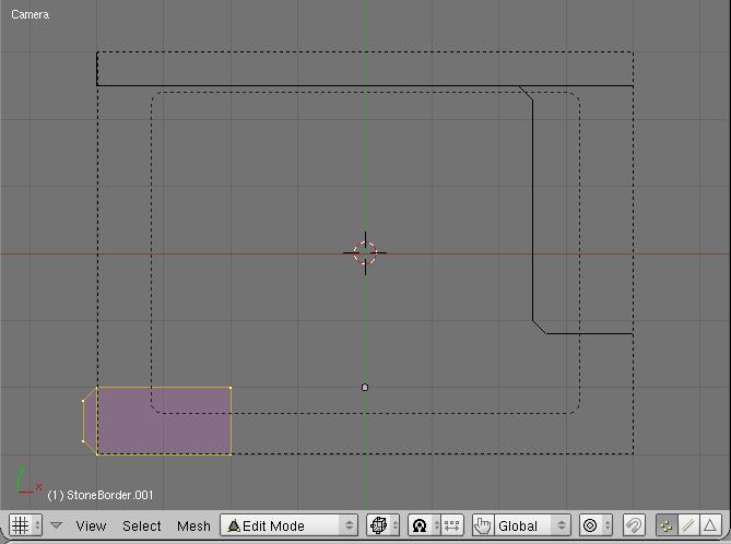
Now we can delete the two vertices hanging off the left edge if we want, then create the bevel on the right side by extruding the edge, then moving the vertex. (It helps to go back to top-down view, Numpad 7, first to get the extra resolution.) Move these four vertices a bit more to the right to enlarge the box.
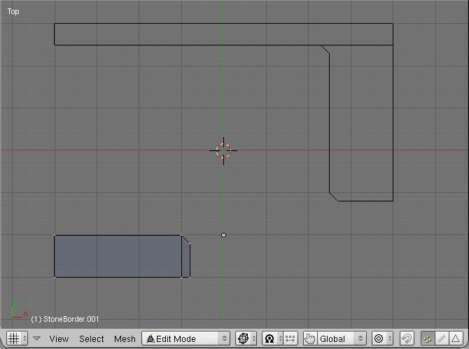
Now that's it for our layer 2! You should save by pressing F2 to save as a new file, or CTRL-W or CTRL-S to save as the same name. If you save using the last option, be sure to click the dialog that comes up, or your file won't save. (If you decide you don't want to overwrite the same filename, simply move the mouse off the dialog instead to cancel)
Now let's add layer 3 to our selection. Hold SHIFT then press on the button for layer three (exit edit mode first by pressing TAB), and we should see a new pair of boxes show up.
Meshes on layer 3 are filled with 'stone', in contrast to layer 2 which just takes the outline. This gives us areas to put buttons, but we also need to use it to make separators. The outline taken from layer 2 takes the WHOLE outline - adjoining pieces don't have any outline between them made automatically.
Let's edit this mesh by selecting it then pressing TAB. Try to arrange the mesh so it looks like the following:
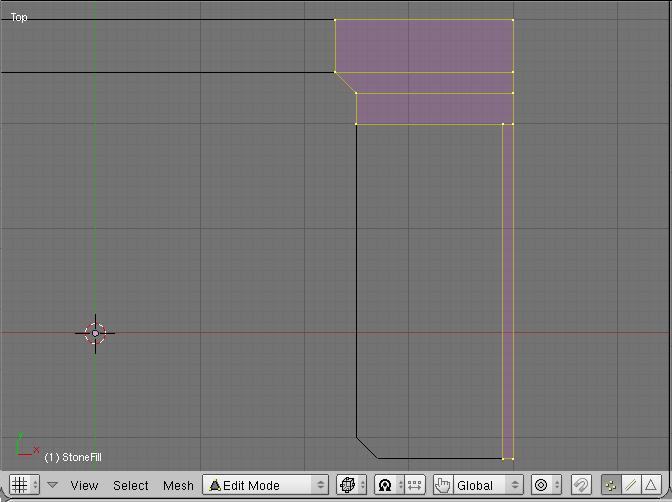
Now I'll show another helpful hint. If you want to select a particular box, hover the mouse over a vertex and press the L key. This will select all linked vertices - helpful when two boxes are on top of each other and you want to move one. Also, if you drag with the middle mouse button after pressing B for box select, it will subtract items from your selection instead of adding them.
We want to add some borders across the top and bottom, now. The best way to do this is to select the right-border piece by hovering over one of its vertices and pressing L. Then, we'll duplicate it (press SHIFT-D) and drag this new box to the left. Now we have a new box to play with!
If, by accident, you drag some vertices without holding CTRL and they become free-floating, you can easily snap them to the grid. Select the vertex, then press SHIFT-S. Select the "snap selection to grid" option, and there you go. :)
Now that we know how to create new boxes quickly, let's fill up things so they look like the following:
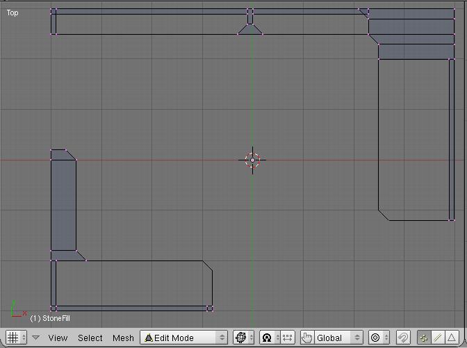
You may be wondering why we also line the edges with fill blocks. This is because sometimes the outside edges are tricky - sometimes they render properly, sometimes they don't, so it's better to be safe than sorry.
We're almost done making our menu! :-) All that's left are the dark green fills, and some bright green lines if we want. If you want to do this step in the image editor of your choice (Photoshop, GIMP, Paint Shop Pro, et cetera) you can skip ahead to the rendering.
Our bright green lines are made by a curve on layer 3. Currently it's way too difficult to line these up with our final stone fills, because the stone mesh masks do not correspond exactly where the final fills will take place. So let's just delete the thing on this layer. (It's selected in the following image)
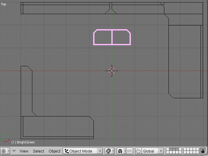
On layer 5 we have our dark green fills. Let's edit this mesh to fill in the open areas. Make it look like this:
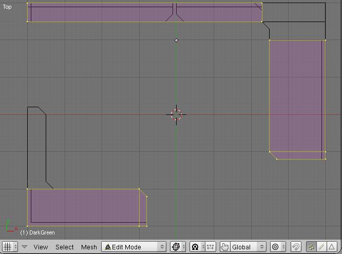
Remember to save your work!
Rendering
An important step to do before every render, which I always forget, is to reveal ALL our layers. If your final render has black instead of stone, or missing other components, then you forgot to do this. Press the tilde (` or ~) key to reveal all layers. It should look like this:
 With all of the layers dark and selected. (Yes, I just re-used the previous image. I'm lazy :P)
Okay, now we get to the part where we can see what we've done! Just exit edit mode, then hit F10 to get to the scene options.

Now, just hit the big "RENDER" button, or you can press F12. (You can press F12 from anywhere to start a render, it doesn't have to be in the scene options.)
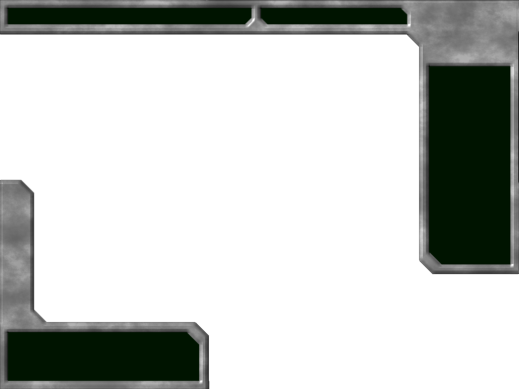
A window should pop up with the following image:
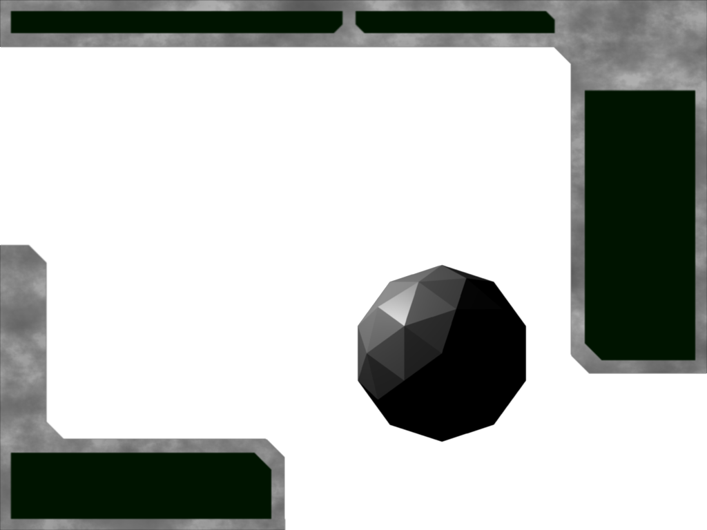
...That's not what we want! Where's the fancy 3D effects? What is that ugly thing in the middle?
Well, now we're at the refining stage. First of all, delete that ugly sphere.
Next, we need to import the bump map that was created automatically when we press F12. (This is a customized thing I did with the compositor nodes. Blender doesn't automatically create bump maps for you based on reading your mind, as nice as that would be.)
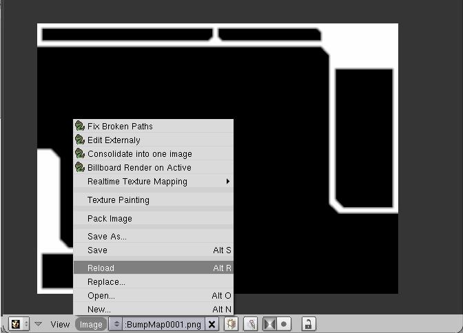
Switch to the screen SR:2.6-ImageRefresh. It should look like this:
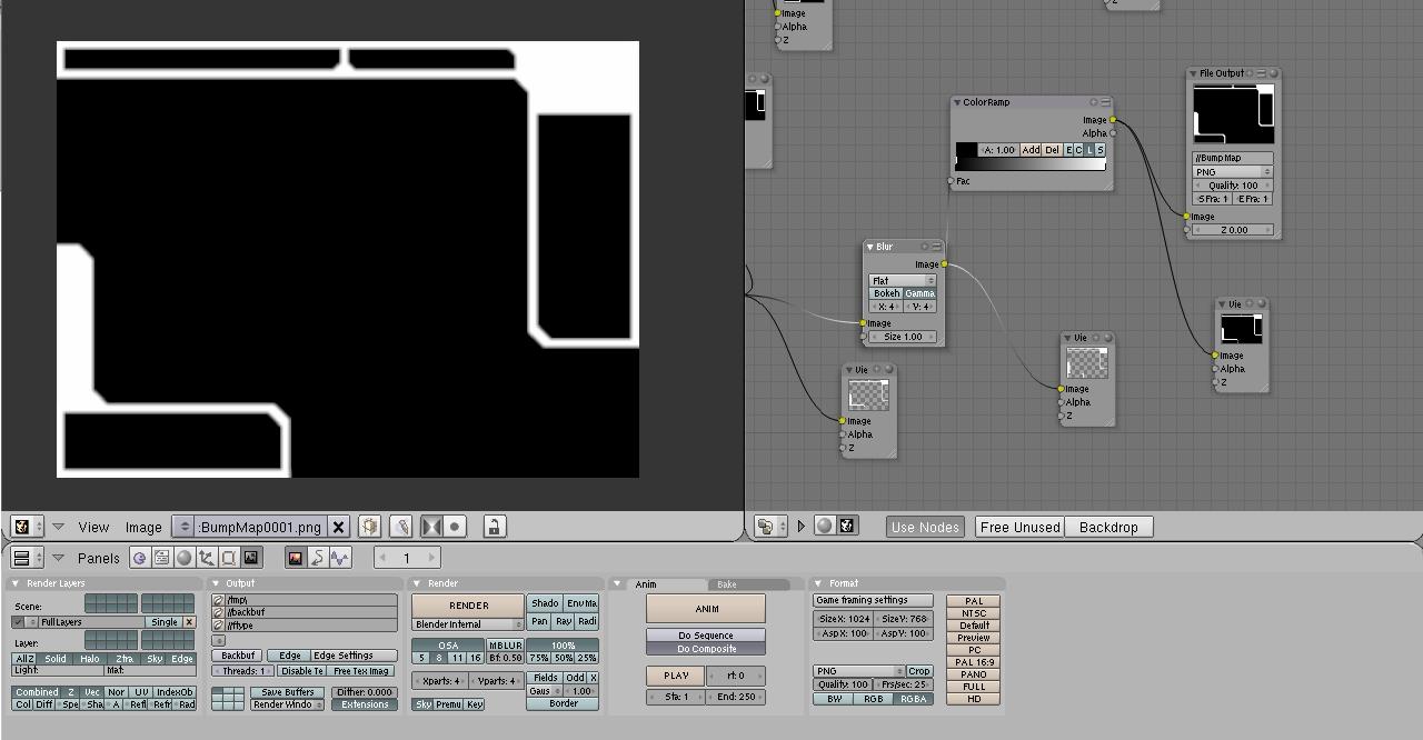 (Ignore the noodle-looking things to the right. That's just the compositor node setup, and you don't have to worry about that at all. :) )
Luckily, in our case, the image loader has already loaded the bumpmap file! How cool is that! However, now that it's loaded a file, it will stay in cached memory. That means even if you change the layout of our menu masks on layers 2 and 3, Blender won't automatically reload this image after it saves it. In any case, reload the image by going through Image->Reload.
Now, press F12 to render again. If it still looks flat (exactly like before) then we might have to update the bumpmap manually.
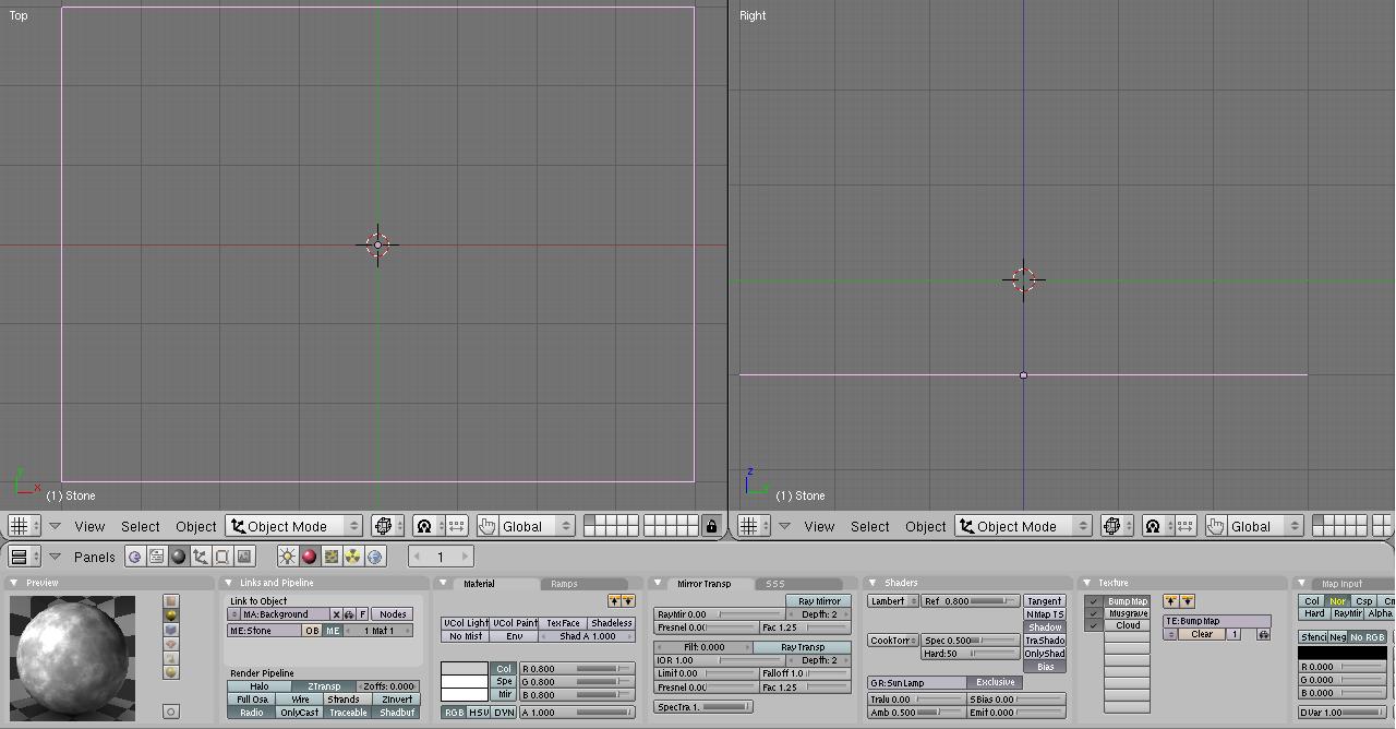
Go to layer 1. Remember how I said you won't need to touch this layer? I guess I lied. Select the big plane on this layer (named Stone) and go to our Shader settings by pressing F5 (or clicking on the sphere).
Now go to our texture settings (F6 or the texturey icon). You should most likely see the same as below, but the texture preview box on the left will be completely black.
Just click the "Reload" button highlighted, and Pop! Up comes a blurry version of our menu!
All we have to do now is reveal all layers (!!!), save, and render again by pressing F12.
Voila! There we go! You can press F3 to save this image, or you can look in the directory you saved your blend to. There should be an image called "renderoutput0001.tga" This .tga file has the transparency information UFO:AI needs.
Our work probably still isn't quite done. First of all, any bright green lines have to be added in an image editor of your choice. (Currently it's WAY too much of a pain to try to line them up nicely in my current setup.) If you want to add some fancy metal thingies, that will also have to be done in an image editor. I suggest looking at a compilation by RaXar in this thread: http://ufoai.ninex.info/forum/index.php?topic=1648.0
Also, UFO:AI needs the image split into four smaller ones. I don't know the exact split, or the reasons for the split, so you will have to ask a UFO:AI developer for that.
In addition, it might be necessary to flatten the alpha in your image information. I don't think UFO:AI accepts partial transparency info, and I don't know what it does if it receives any.
