Difference between revisions of "Proposals/Reaction Fire UI"
(No difference)
|
Latest revision as of 11:49, 13 August 2013
Description
This is a brief proposal outlining an idea to improve player comprehension of the reaction fire mechanic. It is a source of constant complaints and accusations that it is unfair, in spite of the fact that it is one of the few mechanics in the game in which players and AI are treated exactly the same.
Because it is such a vital gameplay mechanic, and one which impacts greatly on players' sense of fairness within the game, we should do more to communicate precisely how this mechanic works and what is going on.
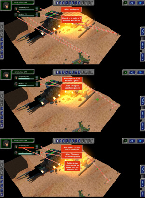
This proposal suggests the best way to accomplish this is by displaying the TU relationship between spotter and target as it happens during the opponent's turn. When a target comes into view of a soldier during the opponent's turn, a panel will pop up showing the soldier and the target, the soldier's reaction firemode and TU cost, and a small bar graph showing how many TUs the target has accumulated towards the reaction fire.
Notes
- Reaction fire progress panel should only be displayed during the opponent's turn. The player should not see his exposure to opponent's reaction fire.
- Reaction fire progress panels should only be displayed for the currently active target. Otherwise a 12-man team could quickly end up with several dozen panels on screen.
