Purpose: convenience, retracting unused space.

Now there are two pieces of the screen, which is not used (2 and 3) and one who is busy absurd information about names (1). To be fair to say that site 3 is present because of 'exit' button.
I also hard to understand the use of windows with weapons:
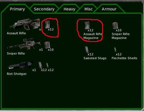
I have 24 clips assault rifle? Why should the same information - this is just confusing. If the weapons were so many bullets that would have to look for, it is likely this division would have been justified, as I understand it in this case and the cartridges would be a long list, and search among the small pictures bullets harder than finding a great icon of weapons and ammunition clicking on next to him.

To get to the Kerr-blade must scroll through the list of zero guns - why zero guns on top, as they still can not equip the crew? Plus, an empty space on the right - see above.

If the pictures of past use half of the screen was at least theoretically justified, then there is absurd to give a half-empty box under the seat, while adding scrolling.
Well, actually my version:

1 - It is convenient to equip the new crew, picking up every weapon on skills and simultaneously comparing knockdown. How would the top - the soldiers and their characteristics, bottom - weapons and their characteristics. To save space, I made the icons, it is true that some small, perhaps they should be increased.
2 - Forming a team at the same time I see someone and as I have already fitted out - instead of surnames and names we see of weapons from his right hand, you can highlight the problem of soldiers (no bullets, it is impossible to perform an action from paragraph 3). For choice, I added scroll as eight soldiers not fit. At the mission rarely goes 8 people think scrolling acquitted.
3 - "Quit" button in my version of the screen is now eating nothing, but I think there can be placed any buttons, for example: (from top to bottom) undo the last button, remove all equipment at the soldier, to give all soldiers the selected object at least on 1 piece, remove clips from all etc.
