project-navigation
Personal tools

Author Topic: Equip soldiers improvement  (Read 5731 times)

Offline sotnikov123

  • Rookie
  • ***
  • Posts: 17
    • View Profile
Equip soldiers improvement
« on: May 23, 2010, 01:14:33 am »
Purpose: convenience, retracting unused space.


Now there are two pieces of the screen, which is not used (2 and 3) and one who is busy absurd information about names (1). To be fair to say that site 3 is present because of 'exit' button.

I also hard to understand the use of windows with weapons:
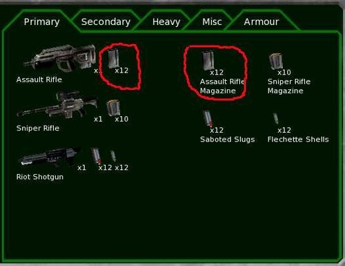
I have 24 clips assault rifle? Why should the same information - this is just confusing. If the weapons were so many bullets that would have to look for, it is likely this division would have been justified, as I understand it in this case and the cartridges would be a long list, and search among the small pictures bullets harder than finding a great icon of weapons and ammunition clicking on next to him.


To get to the Kerr-blade must scroll through the list of zero guns - why zero guns on top, as they still can not equip the crew? Plus, an empty space on the right - see above.


If the pictures of past use half of the screen was at least theoretically justified, then there is absurd to give a half-empty box under the seat, while adding scrolling.

Well, actually my version:

1 - It is convenient to equip the new crew, picking up every weapon on skills and simultaneously comparing knockdown. How would the top - the soldiers and their characteristics, bottom - weapons and their characteristics. To save space, I made the icons, it is true that some small, perhaps they should be increased.

2 - Forming a team at the same time I see someone and as I have already fitted out - instead of surnames and names we see of weapons from his right hand, you can highlight the problem of soldiers (no bullets, it is impossible to perform an action from paragraph 3). For choice, I added scroll as eight soldiers not fit. At the mission rarely goes 8 people think scrolling acquitted.

3 - "Quit" button in my version of the screen is now eating nothing, but I think there can be placed any buttons, for example: (from top to bottom) undo the last button, remove all equipment at the soldier, to give all soldiers the selected object at least on 1 piece, remove clips from all etc.

Offline geever

  • Project Coder
  • PHALANX Commander
  • ***
  • Posts: 2561
    • View Profile
Re: Equip soldiers improvement
« Reply #1 on: May 23, 2010, 02:06:33 am »
Purpose: convenience, retracting unused space.

This is the planned layout.

-geever

Offline bayo

  • Professional loser
  • Project Coder
  • Captain
  • ***
  • Posts: 733
    • View Profile
Re: Equip soldiers improvement
« Reply #2 on: May 23, 2010, 10:08:09 am »
I also hard to understand the use of windows with weapons:
[...]
I have 24 clips assault rifle? Why should the same information - this is just confusing. If the weapons were so many bullets that would have to look for, it is likely this division would have been justified, as I understand it in this case and the cartridges would be a long list, and search among the small pictures bullets harder than finding a great icon of weapons and ammunition clicking on next to him.

No. ammo screen is a recapitulatory and an informative screen.

A recapitulatory: If 3 weapon use the same ammo, u will have dup on ammo next the weapons (for example 3 time x12 cause). Then here you have the exact number of ammo u own. But we can remove the number over the ammo next to the weapon, or displaying it gray, smaller, only display it when the mouse hover the ammo... i think it can be better for the "what i own".

A an informative screen: It provide the real name of weapon, and then we see conrespondancies or thing look like the same, but are not the same. ATM the bigger part of the GUI use name for items. Market, transfer... real name is need, And as u can see there space for it.

To get to the Kerr-blade must scroll through the list of zero guns - why zero guns on top, as they still can not equip the crew?
There are not on the top, they are somewhere on the list. And on your case, it is on the top.
We alos use this list as a weapon summary. We can display description about everything we can have, then u can compare thing... and come back to the market... or the weapon is no more on the inventory but a soldier use the last one.
We dont display them on the bottom, cause we think it is not a good idea to provide different  sorted list. Specially when you equip the last item from the inventory, or when you unequip some you dont have on the inventory.

I dont know if it is better to remove x0 items.


Well, actually my version:
[...]
Position of 2 versus 3 looks very bad. There is no logical relation.

2 looks also very small. But while we dont what to do with the bottom of the screen, i can't know.

Offline Borsti67

  • Squad Leader
  • ****
  • Posts: 164
    • View Profile
Re: Equip soldiers improvement
« Reply #3 on: May 23, 2010, 11:17:26 am »
It would be helpful anyway, if unavailable weapons etc. could be moved automatically to the end of the list. This would save a lot of unnecessary scrolling!

Offline Edi

  • Squad Leader
  • ****
  • Posts: 296
    • View Profile
Re: Equip soldiers improvement
« Reply #4 on: May 23, 2010, 11:35:11 am »
It would be helpful anyway, if unavailable weapons etc. could be moved automatically to the end of the list. This would save a lot of unnecessary scrolling!
Quoted for truth! YES!

In my opinion the screen as it now stands is fairly good already, but weapons that are not present in the inventory should be shown at the end of the list, which would make the management much easier.

Shwoing the ammo clip pictures next to the weapons is a very good idea (for example, both flechette and sabot for riot shotgun and the four grenade types for grenade launcher). However, showing the actual number of available clips should be in the screen where only the available ammo inventory is displayed. This would remove confusion about the number of ammo available.

Though that part is pretty clear already in any case.

Offline sotnikov123

  • Rookie
  • ***
  • Posts: 17
    • View Profile
Re: Equip soldiers improvement
« Reply #5 on: May 23, 2010, 03:07:23 pm »
There are not on the top, they are somewhere on the list. And on your case, it is on the top.
We alos use this list as a weapon summary. We can display description about everything we can have, then u can compare thing... and come back to the market... or the weapon is no more on the inventory but a soldier use the last one.

I'm not quite clear what is written here. As if I did not understand at all - Google translates unclear. Do I understand correctly that you propose to switch the "actor abilities" and "object info"? This is not a good idea if we have a lot of unused space on the screen, but it is permissible, if nowhere to shove another window.

We dont display them on the bottom, cause we think it is not a good idea to provide different  sorted list. Specially when you equip the last item from the inventory, or when you unequip some you dont have on the inventory.
I dont know if it is better to remove x0 items.

It seems to me to correctly sort the list by the appearance of a new weapon or when it is contrary given to the soldiers as a whole. Accordingly, zero guns at the bottom of the list.

Position of 2 versus 3 looks very bad. There is no logical relation.

2 looks also very small. But while we dont what to do with the bottom of the screen, i can't know.

I tried to alter the existing version, therefore it did not work very well - I used a copy of the weapons from the hands of a soldier. If we can reduce the icon with the weapon it will look better.

---

I want to draw a prototype of the screen, a link to who gave geever. Where can I find it assumed dimensions (as I understand it is assumed 1024 * 768). And the expected size of fonts (letter height). Maybe there are any restrictions (colors, size of icons, the size of icons weapons, the size of man). What else?

Offline bayo

  • Professional loser
  • Project Coder
  • Captain
  • ***
  • Posts: 733
    • View Profile
Re: Equip soldiers improvement
« Reply #6 on: May 23, 2010, 03:32:40 pm »
It would be helpful anyway, if unavailable weapons etc. could be moved automatically to the end of the list. This would save a lot of unnecessary scrolling!
I already reply to that. We dont do it to always have the same sorting (and a list 1 time and another list another time). In fact this feature is already implemented, it is a container node property.

Quote
I'm not quite clear what is written here. As if I did not understand at all - Google translates unclear. Do I understand correctly that you propose to switch the "actor abilities" and "object info"? This is not a good idea if we have a lot of unused space on the screen, but it is permissible, if nowhere to shove another window.
I only talk about the list. If you dont display item somewhere u cant select it, and then u can't display his descritpion.

Quote
I want to draw a prototype of the screen, a link to who gave geever. Where can I find it assumed dimensions (as I understand it is assumed 1024 * 768). And the expected size of fonts (letter height). Maybe there are any restrictions (colors, size of icons, the size of icons weapons, the size of man). What else?
The standard definition is 1024*768. We can change text size and color, icon size... It is the only one limitation. We also have script and code limitations but we can go through. If you are interested by the technique, you can check our scripts base/ufos/ui and a part of the code in src/client/menu
« Last Edit: May 23, 2010, 04:13:14 pm by bayo »

Offline homunculus

  • Sergeant
  • *****
  • Posts: 387
    • View Profile
Re: Equip soldiers improvement
« Reply #7 on: May 24, 2010, 10:52:06 pm »
[...]Now there are two pieces of the screen, which is not used (2 and 3)[...]
as for position 2, how can you say it is not used?
clearly, this space is used for ventilation.

and a little wish: maybe, in the current equip screen proposal, the template assigned to a soldier could be visible next to the soldier name.
so, you would not need to select soldiers in the soldier list one by one to find a sniper, or a grenadier, etc.
instead, you would look for the template name in the soldier list.
or maybe you could assign an icon to a template, in which case you would be looking for the icon.
the downside of the icon would, of course, be that you would need to remember the icon.
something like this:
[Grenadier]John Smith
[Sniper]Jane Smith
the alternative would be editing the soldier's name to reflect what the soldier's role is.
as i don't like codes like S-45 in names, i am currently doing it like this:
John "Kaboom" Smith
Jane "Hawkeye" Smith
well, i would not say it is way too bad, but manual editing of names is not too convenient, and i guess that's what the whole point is.