project-navigation
Personal tools

Show Posts

This section allows you to view all posts made by this member. Note that you can only see posts made in areas you currently have access to.


Messages - Vio

Pages: 1 2 3 [4]
46
Artwork / Re: Symbols for the geoscape
« on: July 21, 2009, 12:15:52 pm »
Quote
left two 'UFO' icons are too vague and confusing

Those are from Josh's concept and are probably supposed to resemble the scout/fighter UFO designs.
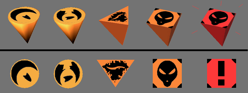
I like their "alien symbol" look. But of course we can add some lines to make them look less abstract:


And thinking of it, when I look at the Geoscape and what has been proposed so far, I believe it would look best to have uniform silver pins (like Ghostas first) sticking in places, with those symbols on circular/square/triangular colored heads.


P.S.: Something like this.


The "code" being
Pin -> mission / temporal marker
Shade of orange -> alien activity
Triangle -> assault (may include installation attacks)
Kerrblade symbol -> terror site


Again, this is photoshopped.
If you would like to try the models in-game, I'd be glad if someone could make them.

47
Design / Re: My comments on the design/gameplay
« on: July 21, 2009, 11:56:15 am »
Revision 24322. I got that from the older "windows installers" thread.

But I found R25186 shortly after, and I've been testing the campaign of that since (all Tamans so far, lol, but plenty of UFOs to sell). Things are like geever says now.

48
Mapping / Re: Impressions about base defence
« on: July 20, 2009, 05:07:11 pm »
I just experienced my first base attack mission... which doesn't seem to have changed too much, according to this old description.

And while I didn't test where the soldiers can move, what I wonder is: Do you want any battle to take place outside, on the surface?
Is that the reason there are so many buildings sticking out? To provide cover?

Because that struck me as rather illogical - since it defeats the purpose of building an *underground* base in the first place. If it was up to me, there would be at least one more layer of earth covering each tile... with only a few trees, a radar dish and some camouflaged gates above.

I know this is just an unimportant detail, or probably a design decision. Still, it's something that strained my willing suspension of disbelief.

49
Tactics / Re: What's a good 2.2.1. squad loadout?
« on: July 19, 2009, 08:39:04 pm »
Quote
You might wan to abandon playing 2.2.1 and try 2.3-dev to see whats new thats being offered - of course, expect bugs still, as debugging and quite a number of other stuffs are being worked on.

U might want to check the TODO list under ufoai:wiki for 2.3 version to see whats done, whats being tackled and wats left before 2.3-stable is being released. Cheesy

Done. Thanks for the pointer.
And yes, there were quite a few bugs... but it's a huge step ahead.

Still, laser rifles own. ;)

50
Artwork / Re: Symbols for the geoscape
« on: July 19, 2009, 08:30:56 pm »
I would, but I don't have any. I just edited Ghosta's pic. :)

That's why I added the flat "textures". I can give you those in other formats if you like.

51
Artwork / Re: Symbols for the geoscape
« on: July 19, 2009, 06:29:15 pm »
I'm with Bayo on the idea to keep things simple - or in this case, making a group of things have common features.
I. e. making all "alien missions" similar either in shape or in color, just like all Phalanx installations etc., in order to keep the globe tidy.

Since radar towers already have unique shapes, and the same is to expected for SAMs, I think groups with equal or similar colors but dfferent shapes are the way to go.

That would mean that all Phalanx installations would be white/blue, for example, but with different models. Crashed and landed UFOs could be round orange pins, with bases being square orange pins. And then, if you zoom in, there are the symbols to distinguish e.g. between crashed and landed.

Other colors should then only be given to special things, like a big red pin for a story-based alien attack.


EDIT:


Something like this for the aliens. Important missions would be the same pins in red and/or flashing.
Or using the exclamation mark, if we want to be blunt about it.

52
Artwork / Re: Artist required for UFOPaedia images
« on: July 19, 2009, 05:57:36 pm »
He is? :D
Don't know how I got that idea. Lol. Maybe because he does Biology, and that's where all the babes in science go. ;)
EDIT: Ok. Mixed that up with Falkland.


As for the pics, I was not aware that there are going to be cutscenes, i.e. more places those 3D faces are going to be used. Nevermind then... I'm sure they can be made expressive enough.

The thing is I'm new to this forum, and while I get a lot of ideas when playing the dev verision, I find it a little hard to get a picture of all the things that are already being done. So I find myself proposing things that are already being worked on or considered. No offense meant.


EDIT2:
Now that I've seen Falkland, I know how that mixup could happen.. because she looks like a short, cross eyed man. ;)
That is, of course, an exaggeration, and I can imagine the difficulty of modding this. But you must admit that she is no beauty.

What I could offer is to take shots of the models (preferrably some with shoulders) and paintshop them into something a little nicer for the headers, maybe add a background, like this:


That would preserve the original look (for better or worse, lol) but still give it a nice touch.

53
Artwork / Re: Artist required for UFOPaedia images
« on: July 19, 2009, 04:55:18 pm »
I would like to make some nice avatars for Cdr. Navarre and Dr. Connor to be displayed next to their mails.

You see, I really like the mailbox with all the messages you get from R&D. It is the main element that keeps the story going, creates atmosphere, and gives character to your subordinates. And in that regard, I think they deserve better than some generic polygon head (especially since Dr. Connor is a woman).

I realize that all other employees are shown as 3D models. But with those two being major characters, and more or less part of the UFOPaedia, I think 2d pictures that match the style of the others here will do fine. Is that OK?


P.S.: I also think that there should be a big "new mail" icon again, so new players will not miss them besides everything else that's going on. And the mails need to have the correct authors on them... but that's another area.

54
Tactics / Re: What's a good 2.2.1. squad loadout?
« on: July 18, 2009, 01:16:34 pm »
I love my flamethrower guy.
There is always a building that needs cleaning up, and the range is long enough to work well even in less cramped spaces.
But most of all, it's the reliability. He is usually on the front line right next to the Redshirt, and there it's important to know that if I make him spend his last TUs to run up to and fire at an enemy, he will kill him. Nothing is worse than an unlucky miss in such a situation.

@Zukn
Lol. So giving the alines outdated human weapons actually makes them stronger.
But you are right. Especially with the indestructible walls, there is little they can do agains Phalanx hiding behind corners if they don't use more stuff like Grenades and Rockets. Heck, they don't even use reaction fire most of the time. Instead they hide behind their own corners and wait for your grenades (or worse: run out into the open if they don't see anyone).
Also love the nade launcher btw.

55
Design / Re: My comments on the design/gameplay
« on: July 17, 2009, 10:57:10 pm »
Quote
It was not removed. Focus on the messagelist itself with the mouse.

It can be closed and reopened.

Really? Oh well, maybe I just missed that. Though I'm certain I tried. It was not the very latest Dev version, however, but 2.4322.


My main skill is really that I can quickly pick up any program or rule system, or at least have no problem spending a lot of time learning and improving stuff, if I'm into something. I did that with editors for various games like Doom, Quake or Half-Life, Ufo2k and some others, not to mention games with "user-friendly" editors like StarCraft. I create my own textures and other resources when I feel the need, and basically like modding everything I understand.
I would particularily like to help improve the AI if that is not too complicated. This is something I haven't done yet.

However I will be on a business trip / holiday during August, and I can't promise anything for the time after.
I guess I will just keep an eye on the things that are being done and talk to people when I see something I'd like to help with.


56
Design / Re: My comments on the design/gameplay
« on: July 17, 2009, 06:24:57 pm »
Hey

I'm also new to this game, and therefore had the chance to collect first impressions from an "outside" point of view before coming here. While I'm no programmer I have a history of mapping and modding of games, including some work with the Ufo2000 team, so I can and do appreciate how much work you have put into this great project.

I've played 2.2.1 and a had a look at the latest Dev build. Generally, it is a solid game, especially the stable release, and there are not many features one would miss if one didn't know X-Com. Only a few things struck me as "unfinished", most of which have been covered by Suliman. Still, a few comments on what I noticed in that regard:


OPTIONS MENU
The first place I usually go. The menu is functional, though one does note the missing keybinds. The graphics options, however, could use some tooltips explaining what things like "Texture compression" do.
What is more, it would be nice not to have to restart when changing the brightness/contrast - or simply not needing to do so. On my system, all battlescape/3D graphics in the dev version were way too bright at standard settings, creating a graphical mismatch in the staff/plane menus and an ugly, completely bright battlefield.

STORY TEXT
The scrolling intro is well written, but could use some black borders. Especially across a widescreen, the formatting looks painful.
A background would also be nice, if not several (i.e. making it a slide show).

GEOSCAPE UI
The new globe options like radar and countries are great. What I do not understand is why the intuitive "message list by mouse-over" was removed. And in a detail, if the menu takes up the right side of the screen, it would be nice to place the globe a bit to the left.

BASE BUILDING
The new floating build window prevents the base view from being compressed in build mode, but in turn gets in the way of viewing it in the first place. I had to keep moving it around and wished it could be minimized, which didn't feel like an improvement.
Imo displaying the costs of a room at the bottom right would suffice, not necessarily showing a graphic. Or displaying the (interlaced?) graphic when choosing a location, instead of just a frame.

EMPLOYEES
What Suliman said. From a game designer's point of view, there is no point in making players choose individual scientists or workers if that decision does not lead to distinguishable consequences. In that regard, it is tedious business that goes against the principle of "KISS". So it's good to hear it is being adressed.
One possible solution that doesn't obsolete the existing models would be to put two or three of them on a screen (e.g. "Scientists") that lets you adjust their numbers and provides an overview.

The thing is, this also applies to the newly introduced pilots. Unless you are planning on giving them improving stats, or make their possible shortage a game element, I see no reason why they shouldn't just ship with their craft.
Even there were stats, those could still be tied to the craft itself, because it is unlikely that an experienced Stiletto pilot will be better at flying a transport.


Sadly, those are things I can not help to improve myself due to lack of programming skills.
On the other hand, I'm certain that I will find some things on the todo list that fit my skills, so I can contribute to this nice game when I find the time. Because I sure would like to.

Regards
Vio

Pages: 1 2 3 [4]