project-navigation
Personal tools

Show Posts

This section allows you to view all posts made by this member. Note that you can only see posts made in areas you currently have access to.


Messages - UlteriorMotives

Pages: [1]
1
Artwork / Re: various Visual Identities make a world convincing
« on: April 09, 2009, 11:56:03 am »
And the Oceanian flag.

[attachment deleted by admin]

2
Artwork / Re: various Visual Identities make a world convincing
« on: April 09, 2009, 11:55:20 am »
I've worked up new designs for the UA and Russia as well:

Russia: Essentially a variation of the current Presidential flag with proper colors. Removed symbols of Czarist authority (as well as the St. George part of the coat of arms) mainly because it would have been more work. Somehow I felt just adding a star was too simple.

United America: The old design felt more fused than united. Used an eagle to reflect the union between the US and Mexico. The colors of the banner at the bottom reflect the national colors of the member nations. The UA/AU symbol is meant to reflect the multilinguality of the UA, since I assume Spanish (and possibly French) would be recognized languages as well, which would change the order of the letters.

[attachment deleted by admin]

3
Artwork / Re: various Visual Identities make a world convincing
« on: April 09, 2009, 11:49:14 am »
I like it, but it's too busy and lacks the simple punchiness of the old flag. I think you'd have a tough time improving on that design.

The original is a pretty slick design. My only real beef with it is that it's essentially a slightly modified Surinamese (Surinaman?) flag, and Suriname is perhaps even less Latin American than the United States. If that design gets kept, I wanted a more representative design to at least have been considered.

Quote
Good improvement, however I liked the design slightly off-centre as most of the other flags have centred designs. Can you move it slightly to the left?

I'd strongly recommend changing the EU flag as little as possible, seeing as it's legally required to stay the same. Adding a star reflects its name as the Greater European Union, though in earnest, I doubt there's real concern from the EU for using the original design:

Quote
Use by third parties

The European emblem may be used only if:

  • there is no likelihood of the user of the emblem being confused with the European Community or the Council of Europe;
  • the emblem is not used in connection with objectives or activities which are incompatible with the aims and principles of the European Community or of the Council of Europe.

Permission to use the European emblem does not confer on those to whom it is granted any right of exclusive use, nor does it allow them to appropriate the emblem or any similar trademark or logo, either by registration or any other means. Each case will be examined individually to ascertain whether it satisfies the criteria set out above. This will be unlikely in a commercial context if the European emblem is used in conjunction with a company's own logo, name or trade mark.
Linky

That said, I did tweak it and made off center version as well.

[attachment deleted by admin]

4
Artwork / Re: various Visual Identities make a world convincing
« on: April 08, 2009, 04:16:20 pm »
UlteriorMotives, can you re-render your flags in 485x300? That's the resolution of the flags we currently use.
Sure, though it'll break my heart to use a ratio other than 2:3 =P

You want all of them or just the ones that have been "approved"?

5
Design / Re: A little detail that could improve gameplay a bit
« on: April 02, 2009, 10:18:06 pm »
Assuming it were possible in the first place, why not both? Use yellow for soldiers that used some of their TUs and red for those that used all.

6
Artwork / Re: various Visual Identities make a world convincing
« on: April 02, 2009, 10:16:12 pm »
Pitching a couple more flags:

Revolutionary Countries: Used the colors of the flag of Gran Colombia, the country the liberator of the Spanish colonies in South America, Simon Bolivar, ruled. Hugo Chavez, for instance, sees his socialist revolution as a continuation of Bolivar's struggle, and I'm postulating so would the modern revolutionary countries (besides incorporating former non-Spanish colonies).

Commonwealth of Oceania: I tried something that moved away from the seven pointed star, as that's largely exclusively Australian. The globe is from the original commonwealth flag, as is the blue partial circle, which represents the Pacific and Indian Oceans. The southern cross gets used by a couple other Oceanian flags, so I included that as well.

Greater European Union: I basically used the same design as the previous one except that the stars are centered again and the colors are the official ones, because the others were off, as someone noticed.

[attachment deleted by admin]

7
Artwork / Re: Interested in contributing artwork
« on: April 01, 2009, 10:40:11 am »
Don't think I'd be able to deliver a realistic painting. Ah, well.

8
Artwork / Re: various Visual Identities make a world convincing
« on: April 01, 2009, 10:37:12 am »
I like your Asian and African flags, but the Middle-East flag doesn't do anything for me. It's too busy and fragmented.

The flags aren't set in stone yet, so if you really think you can improve on what we've got then you're quite welcome. The Asian one is definitely better than what we had before so I wouldn't mind replacing that one. The African one is a toss-up, I also quite like the old one.

Our need for revamped GUI artwork is also quite pressing, do you think there's anything you could do on that score?

Regards,
Winter
As I said elsewhere, the flags were done before I knew what the others looked like. I'm partial to the old African flag as well, as it uses pretty much the same concept as mine.

Not sure about the GUI, what exactly are you looking for in that regard.
our other flag images are released under "GNU General Public License 2.0 or later" is that ok for you, too?
No problem on my behalf.

9
Artwork / Re: various Visual Identities make a world convincing
« on: April 01, 2009, 12:50:48 am »
Posted these under a new topic earlier not having seen this thread. No idea if the flags are set in stone already, but here's some designs I came up with:

Asian Republic - tried to use symbols from the more prominent Asian countries Korea (taegeuk), Japan (rays from the naval flag), and China (yellow stars on red).

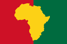
New Africa - Took three of the panafrican colors, red, yellow, and green and combined them in a flag similar to Burkina Faso's, except with a vertical bicolor as opposed to a horizontal one.

Middle-Eastern Alliance - Picked the Panarabic colors and arranged them in five stripes so that they still feature the former flags of non-Arabic countries such as Iran and Afghanistan.

[attachment deleted by admin]

10
Artwork / Re: Interested in contributing artwork
« on: April 01, 2009, 12:44:12 am »
Thanks, I'll pitch the flags there, possibly even a reworking of the PHALANX symbol eventually. How feasible is my idea for the load-screen images?

11
Artwork / Interested in contributing artwork
« on: April 01, 2009, 12:32:05 am »
Hi, I've played UFO:AI a couple times and recently rediscovered it. I'm a bit of a graphic artist with an inclination towards drawing flags and maps. I've attached a couple things I cooked up in the last few days and wouldn't mind feedback as to whether there's room for it in the project or not:

I started designing a couple of the flags before figuring out where all the artwork is at:


Asian Republic - tried to use symbols from the more prominent Asian countries Korea (taegeuk), Japan (rays from the naval flag), and China (yellow stars on red).


New Africa - Took three of the panafrican colors, red, yellow, and green and combined them in a flag similar to Burkina Faso's, except with a vertical bicolor as opposed to a horizontal one.


Middle-Eastern Alliance - Picked the Panarabic colors and arranged them in five stripes so that they still feature the former flags of non-Arabic countries such as Iran and Afghanistan.

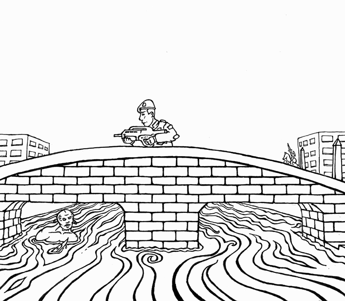
Also, having played the original X-COM, I've found the mission loadscreens to be a bit wanting when it comes to conjuring X-COM's unique atmosphere of apprehension. I'd be interested in making individual loadscreens for the missions if there's room for this, preferably in cooperation with a colorist, as I'm rather unpractised in that regard. Here's the line-art version of what I thought would do for the map "Rivertown" (at least I think that's what it was called"):


I haven't bothered coloring it yet, since someone else might want to give it a shot as well and since it would be a bit much effort if the map screenshots are going to stay.

Lastly, I've only played the latest stable build 2.2.1 x86, so I have no idea how overlays have been or are planned to be implemented, but I'd be interested in working on an alternate political overlay to the one on sourceforge.

Comments?

Pages: [1]